
18 ways to foster success in responsive web UI projects
Most websites today are responsive, meaning that their web user interface (UI) supports a variety of screen formats and resolutions. Responsive design lets users view and interact with pages on any size screen from large desktop monitors to small mobile phones. A responsive web UI provides a seamless, uniform user experience across channels — and it can help organizations save on development costs.
Although responsive design has been around for almost 10 years, many development teams struggle to implement it when migrating existing websites or building new ones. Here are some best practices for responsive design and development that we have learned from completing a number of responsive web UI projects. While this advice focuses on issues for front-end development, it also touches on aspects of UI/UX design, testing, and team interaction.
Exploring common misconceptions
Even though developers have been building responsive web UIs for a long time, some organizations still have misconceptions about creating responsive web applications from scratch and applying responsive principles to existing projects. For instance, some people believe that:
- Adding responsive functionality requirements can double the project workload
- Making a web application responsive just means designing and coding additional screens for mobile devices
- A web application can be either responsive or not – there’s no halfway state
- Making a site responsive is simple enough – just make changes to the HTML and CSS code
All of these statements can be correct, but they aren’t always true. If you believe them, your team might think their work will look like this:
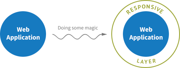
Unfortunately responsive UI is not that easy and believing it is will always cause problems. Individual developers without a clear vision will do what they think is right, and the end result may be a Frankenstein's monster of an application: ragged, with a poor user experience, full of code duplication and other nasty issues.
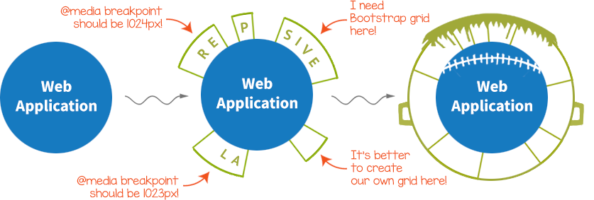
When you start working on a project, you may be tempted to start implementing immediately so you can show results as soon as possible. But your customer will be more pleased if you demonstrate a well-architected, fault-free, fully documented project at its completion. You help ensure success by considering the following tips.
Before you start coding
1. Set a fixed deadline for your project
Often, at the beginning, no one knows how much time a project will take. Taking a relaxed approach to completing a project may give developers time for research, but lack of a firm deadline may also encourage them to take longer than a client would like. To keep things focused, ask yourself:
- What would we do first if we had only three months to complete everything?
- What do we need to do to reduce amount of time needed for a new developer to understand how the project works if another developer were hit by a bus? In other words, how can we facilitate knowledge transfer?
- What tasks that you planned to do first become less of a priority after you answer the questions above?
Your team can be more prepared for unforeseen circumstances if you consider these questions in advance and act based on the answers you come up with.
2. Structure your UI design specs
Whether you work with a UI design provided by a customer or have your own design team, you will deal with UI design specifications and mockups. They may come in PSD, AI, or Sketch format, or in a more schematic Axure or similar format that describes user interactions. Don’t worry too much about the format – they’re all just images. But since the design specs will come to you in separate files, you need to consider how they should be organized.
- Are the screens separated intentionally or dumped into a single folder?
- If separated, do you understand the reasoning behind why they’re separated in a particular way?
- Are there duplicate files or near-duplicates?
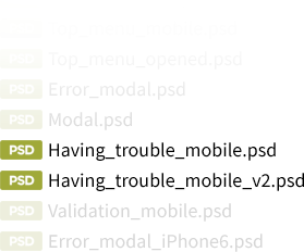
- Do some files contain common components? Do you understand how they fit into the project’s organization?
Sometimes the best approach is to organize the design documents’ structure yourself. It’s better to have clear rules you understand than to have no rules or fuzzy ones. Here’s a simple approach to creating a structure you can work from:
- If the screens are not structured at all, group them by whether they belong to a particular feature. Then select all the responsive states of the same screen and group them under the first grouping, as subfolders. For example:
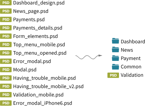
- If the screens are already grouped but the grouping rules feel too vague for you, reorganize them according to the rule above. UI design specs are part of the functional requirements for the product. Vague requirements will impede the development process and cause trouble when you need to create test cases.
- If you see duplicates or different versions of the same screen marked with names like feature_v1 and feature_v2, you have issues with design versioning. Ask the design spec authors to keep their internal versioning system within the design team and provide you with only the final versions.
- If you don’t have a style guide or a pattern library that contains all the components used within the project, ask the design team to extract all common components to a single folder or a hierarchy as outlined in the first point that can serve as a reference for developers to turn to when they need to know things such as size, indentations, and location of typical elements. Having a style bible or pattern library should reduce duplication of code and improve user experience.
3. Use a component-based approach everywhere
Component-based architecture breaks client-side code into small segments that implement individual features, isolated from each other. You then construct the application from these pieces. This approach has become the de-facto standard in front-end development. All modern client frameworks are component-oriented.
Unfortunately, we haven’t seen similar progress in the UX/UI world. Movements such as atomic design and Sketch Symbols are attempting to apply this approach, but are still not widespread.
If you have not been provided with a pattern library from which to assemble your responsive screens, request that the design team create and support one. Without a pattern library, you’ll be compelled to implement the elements that you create again and again in numerous, slightly different variations, and you won’t be able to use the most modern and well-designed component-oriented client side frameworks. You’ll wind up with spaghetti code.
4. Require all viewport states to be presented in UI design specs
Have you ever heard a designer say, “I didn’t add this screen for tablets because it’s the same as the mobile version. Just use the same screen.” If you hear something like that, push back. Every responsive team has a list of responsive states for the viewport – usually three or four. All of them must exist as a UI design spec at all stages of development. If they don’t, you’ll likely run into difficulties during the feature implementation stage. You’ll also be forced to answer questions from the QA team because they won’t find the necessary screens in the UI specs either.
5. Make changes in UI mockups trackable
Team members need to be able to see what, when, by whom, and for what reason something has been changed at any stage of the project, whether it’s a description of a task in a task tracker or the application’s code. Making all changes trackable has many benefits:
- You can find the person you need quickly if you have a question about changes they made.
- You can revert to the previous version. This can be useful if you have to start over after a week of working on a task.
- You can restore the sequence of changes you or someone else made. This can be useful if you’re accused of violating any agreements. If that happens, you can bundle up not only the applicable email discussions, but also task editing history, task comments, and code changes.
Unfortunately, while developers can take advantage of versioning tools like Git, there are no similar tools for design, because UI design specs rely on images, and there are no tools to compare differences between them. To track design changes you have several options, none of which are ideal:
- Get a dump of similar files for each specification. You’ll have to look for differences manually in graphic editors.
- Read text messages from designers. In the best case, if you’re using a tool like Zeplin or Invision, which use text bubbles, these messages muddle the UI specs. At worst, you’ll have to read and save all of the comments and emails with explanations of what was changed.
- Try to understand what was changed in the UI spec without any help. Chances are you’ll miss some of the small details.
- Version the changes for each component and save each component's change as a new version.
A manual versioning system might look something like this for Sketch-like formats:
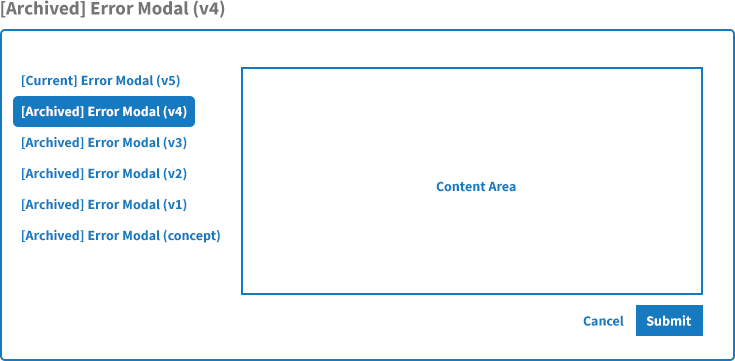
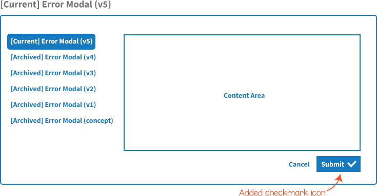
The folder structure might look like:
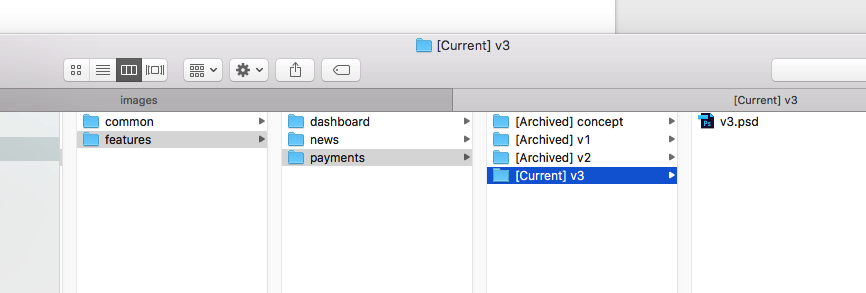
As you can see, with this approach you have to store copies of the entire UI design each time.
If you have to go this route, ask your design team to not expose all changes they make to the developers, but rather keep their internal work within the design team. Ask them to provide batches of UI changes no more than once in a certain period. For instance, they could provide changes a few days before the start of a sprint for Scrum teams.
Another possibility for tracking design changes bound to a particular feature is to create a task in a task tracker. For this to work, the changes must not add or modify anything except the feature in question. This approach requires thoughtful task decomposition, discipline, and good team cooperation.
Practices like this will compel designers to take care when making changes in specs, and therefore in functional requirements, and will illustrate for them some of the cost of changes in requirements. It will decrease the number of design → implementation → deployment → QA iterations. It also will simplify (but not eliminate) this process.
Following this approach may increase the number of files you have to maintain, but storage space is inexpensive compared to the cost of the time you will waste otherwise. If disk space becomes a bottleneck, you can remove old files if you’re sure they’re no longer necessary.
Bonus benefit: This approach encourages designers to treat UI components as small pieces and supplements your component-oriented approach.
6. Define @media breakpoints unambiguously
Now let’s turn to some suggestions solely for developers. Take a look at this requirement for breakpoints:
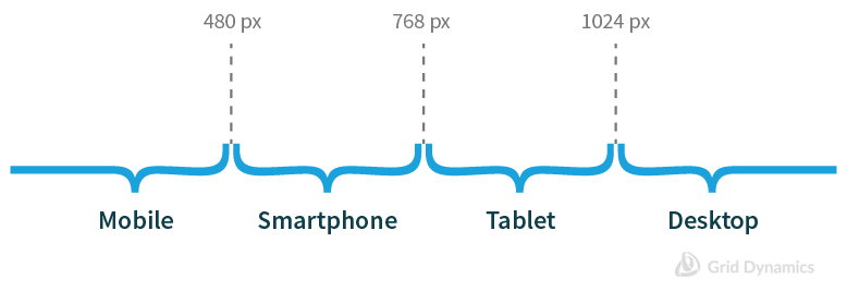
Looks good – but what the breakpoints values will you define in the code? The correct answer (in pseudocode) is:
mobile: 0-479; // not 0-480
smartphone: 480-767; // not 480-768
tablet: 768-1023; // not 768-1024
desktop: >1024;
Defining breakpoints this way eliminates style intersections at 480, 768, and 1024 that could cause errors. As a bonus, it also ensures the correct styles are displayed on devices that have a resolution of exactly 480, 768, and 1024.
You should also get rid of the mention of particular categories of devices and use descriptions of screen sizes instead:
extra-small: 0-479; // not 0-480
small: 480-767; // not 480-768
medium: 768-1023; // not 768-1024
large: >1024;
7. Viewport or platform? Make it clear how adaptive styles should be applied
Responsive styles are related to the viewport and should not depend on a browser or platform. Users should be able to see the styles that they expect to see on the mobile phone by resizing a browser window on the desktop. This is how responsive design works. Make sure the customer knows this before you start working to avoid misunderstandings later.
8. Make sure the list of browsers and platforms supported is precise
Ask the customer for a list of supported platforms and browsers with exact versions defined. Don’t accept general specs like “Chrome for Android”; look for specifics like “Chrome 42 for Android 5.0.”
You may encounter resistance from customers who want their applications to work for all versions of a particular browser. This desire is understandable, but trying to accomplish it greatly complicates the development and especially the QA process. Your QA engineers will have to test the application in each of dozens of browser versions to guarantee that each feature works properly. This is a huge amount of work, and the time involved can be expensive for the customer.
Explain to the customer all that’s involved in trying to achieve a 100% guarantee. Also explain that you can significantly reduce the final cost and development speed if you abandon 100% coverage of all versions, checking the application only in specific versions of each browser and catching browser-specific bugs when they appear.
9. Don’t use JavaScript to track breakpoint changes
I’ve been forced to emulate @media checkpoints using JavaScript just once to support older browsers such as Internet Explorer 8 (IE8). Even if a significant part of a customer's audience is still using an older browser, persuade the customer that it’s poor practice to create an alternative mechanism based on JavaScript just for the sake of this segment of their audience.
Using JavaScript to track breakpoint changes is difficult to implement technically, which means it takes extra time to develop and it’s expensive. It’s also a headache to maintain: You’ll have to provide a workaround for IE8 using JavaScript for every feature you develop. And it’s unnecessary – IE8 users don’t need responsive functionality. No IE8 user in the world uses it on a phone or tablet.
If you run into a rare situation during development in which your @media queries don’t allow you to implement a feature correctly, you’re better off changing the design or checking the requirements.
10. Define graphic asset formats for HDPI displays early
Two different approaches allow you to display graphics on any type of display correctly: SVG or multiple instances of the same raster image in different sizes. Both methods are worthwhile, and each has its own best use:
- Use SVG whenever possible. Nowadays, many UI design assets are provided as vector graphics. If your layouts are provided in a raster format such as PSD, ask the design team for vector versions instead.
- Use raster images with @media queries or <picture> tags. Give them names like asset.png and asset@x2.png.
11. Decide on a responsive grid system
In responsive development, you have to use some kind of a grid system. It might be an existing grid system such as Bootstrap or Skeleton, or it may be one you construct based on the styles you create.
In most cases, using an existing skeleton is preferable because they are usually well-documented and provide solutions for typical issues. Consider creating your own responsive grid framework from scratch only if you have at least one CSS expert in your team.
During development
Following all the rules we’ve talked about so far won’t guarantee that you’ll avoid problems during development, because developers are only human. Even on ideal teams some people may resist an established process. Such people are valuable, because they help identify problem areas in the development process and therefore can save you time. But for that to happen, their resistance should be visible. Existing problems should be solved through discussions on retrospectives for Scrum teams or similar conversations for other methodologies.
A small, silent violation of a process may be easy to overlook or ignore, but even a few of them can slowly corrode the development process, to the point where you may find that everything is more complicated than it should be. Taking control of complexity is one of the most important tasks of any development process. Here are a few indicators to look out for.
12. Fixing visual differences between the same components
Everything goes well, but sometimes you see tiny details that are a little off. A submit button is the same as the one on the previous screen, but slightly wider. The page title in the tablet version is supposed to be the same as in the desktop version, but now it seems it has a smaller bottom margin.
These little inconsistencies destroy the user experience. How do they happen? Well, take a submit button as an example:
- A designer develops and provides a UI design spec that has a submit button.
- Developer implements the feature according to this spec.
- Later, the designer provides a UI design spec for another feature in which the same button is used. The designer's hand may have trembled a little, so the button changed its size a bit.
- The developer implements the new feature using the code he created previously, but notices a difference in the button size, so he adjusts the button accordingly to the new UI design spec, overriding some styles.
- .new-feature button { width: 10.43em; }
The human eye can perceive the difference (though not always consciously). The discrepancy provides a poor impression of the product.
To keep changes like this from happening, here’s a revised process:
- A designer develops and provides a UI design spec that has a submit button.
- The designer checks the spec looking for components that will be used on other screens in the future, including, in this case, the submit button.
- The designer separates common components from any others and notifies the developer.
- The developer implements the feature, and places the code of the common component into a single separate file for later reuse.
- Later, the designer provides a UI design spec for another feature in which the same button is used. The designer's hand may have trembled a little, so the button changed its size a bit.
- The developer implements the new feature using the code he created previously, but notices a difference in the button size. However, he knows that for this component, common styles have a higher priority.
- The developer implements a submit button according to the UI design spec created for the common component.
13. Plan for changes in the feature design during implementation
Each modification in a design spec or a task description you decide (or have been forced) to make is a requirements change. Requirements changes affect feature implementation terms because they force developers to make code changes and force QA to go through the test process again. Requirement changes may take a lot of time for responsive projects because of the number of different application states they use.
You must restrict change to the sprint scope during the active sprint. Plan the changes you have to add before you start the iteration.
Scrum takes a two-pronged approach to change. Nothing is allowed to change within the sprint. The team commits to a set of work on the first day and then expects its priorities to remain unchanged for the length of the sprint. However, although no changes are allowed into the sprint, the entire world may be changing outside it.
Scrum’s stance against mid-sprint change may seem detrimental to the success of the project. After all, sometimes the changes are so important that they need to be done. And other times new information may make worthless the work the team is currently engaged in. In both cases I encourage you to take at least initially Scrum’s hard-line stance against mid-sprint change.
To see why, let’s consider examples of both types of these seemingly legitimate causes of mid-sprint change. First let’s consider the case of the product owner discovering some important new requirement that she says needs to be done instead of the work the team is engaged in. Sometimes this will happen. When it does I suggest making the change in sprint goal visible. Scrum does this by having the team announce an abnormal termination to the sprint, which is followed by immediately planning a new sprint to include the newly discovered, high-importance feature. Raising the visibility of changes in sprint goals is important because it makes them less likely to happen. In too many organizations, the only ones who see the constant redirection of the team are the team members themselves. Scrum’s approach of not letting change into a sprint but being willing to abnormally terminate and start a new one raises the visibility of the cost and frequency of change. This will cut down on the mid-sprint changes thrown at the team. Only the most important changes will justify abnormally terminating.
14. Using adaptive frameworks correctly
Adaptive frameworks can be helpful, but they can also get you into trouble if you don’t use them well. Here are some things to look out for:
- Don’t override grid styles with any other styles. This is wrong:
<div class="row">
    <div class="col-sm-4 left-column"></div>
    <div class="col-sm-4"></div>
    <div class="col-sm-4 right-column"></div>
</div>
This is better:
<div class="row">
  <div class="col-sm-4">
   <div class="left-column"></div>
  </div>
  <div class="col-sm-4"></div>
  <div class="col-sm-4">
    <div class="right-column"></div>
  </div>
</div>- If a column size in your design does not match your grid system, either ask a designer to fix it or don’t use the grid system in that spot.
- Don’t stash your grid under the hood. Prefer a declarative approach:
<div class="row">
    <div class="col-md-6">1/2</div>
    <div class="col-md-6">1/2</div>
</div>
...
// No additional styles needed
to a "semantic" approach:
<article>
    <div class="column"></div>
    <div class="column"></div>
</article>
...
article {
 .make-row(); // or a bunch of similar styles
    .column:first-child {
        .make-md-column(6); // or a bunch of similar styles
    }
    .column:last-child {
        .make-md-column(6); // or a bunch of similar styles
    }
}
The second example does the same thing as the first but focuses on CSS for the sake of semantic HTML. But writing markup this way increases the size of your CSS file, complicates reading and testing of your code, and leads to establishing multiple approaches to writing CSS within the project, which causes code inconsistency.
15. Creating extra functionalities to accommodate different responsive styles
An issue you can face: You cannot implement responsive styles for both small and large displays with only a single HTML markup.
Consider the following examples. Links such as “Category #1” and “Category #2” should do nothing in the desktop version, but must have click event listeners in the mobile version to let users slide into a category:
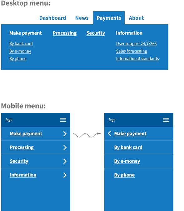
To provide the best interface for the screens for their respective platforms, you should create two components with similar functionality that look different and work differently, and hide one of the two depending on the current viewport size.
You might be tempted to write JavaScript code to handle this, because this case doesn’t involve a responsive styles implementation, but rather a new feature implementation. A feature implementation may require implementing a proxy layer to keep both components' states in sync.
Try to avoid using JavaScript here. Make the case for changing the category of work from new feature implementation to modifying the existing feature, adding responsive styles over the existing one. Explain the cost of new feature development to the customer.
16. Test the product with emulators and real devices
If you use only device emulators to test the product, you may run into situations in which users find problems that your team missed. Unfortunately, emulators are not the same as real devices. Test on real devices at least at the final stage to avoid facing such issues.
General advice
To close out this topic, here are two more suggestions for anyone developing responsive web applications:
17. Prefer native controls to stylized ones
Designers may get carried away and stylize some native components, such as <select>. The result may look beautiful, but under the hood, native components can have very complex functionality that has to be designed and implemented, or a visitors' UX may be seriously limited.
Ask a designer to provide all the necessary states.
18. Get rid of table layouts
A <table>-based layout is not suited for use in responsive applications. If you find tables used as page or feature skeletons, you can deal with the problem in one of two ways:
- Keep using tables for the desktop version and create new markup for your responsive screens, toggling between mobile and desktop versions when needed.
- Get rid of table-based markup and styles and create a whole new responsive markup.
The first option can preserve backward compatibility and will not trigger test failures, but it will complicate responsive development because you’ll have to support two versions of the code.
The second option requires you to create new markup from scratch, so it slows the development process, but the result will be more supportable and easier to understand.
Usually, the second option is preferable, as rewriting the markup affects client-side application logic only slightly and server-side not at all. In complicated cases you can combine both methods.
Conclusion
In this article we described 18 points to consider to help start and successfully deliver a responsive web UI project. The list of the best practices here is by no means comprehensive, but it should help you if you’re a developer who wants to create responsive web UI implementations as efficiently as possible.
Sidebar: Responsive Web UI Development Process Cheatsheet
Let's consider all of the advice here and see how it could help us in the development process.
1. Determine the project’s type:
| From scratch | Over an existing application | One that's applied partially |
|---|
2. Check input data:
3. Handle issues during work:
Check the input data suggestions if you’ve just started working on the project, or routine work suggestions if you already work on responsive projects. Try to cover as many suggestions as you can in the first case, and even if you already have experience, take a look at these suggestions anyway.
If you cover all of the cases mentioned in this article, you should be following a transparent approach that looks like this:
|
Design side |
Developers side |
|---|---|
|
PREPARATION:
WORK PROCESS:
|
PREPARATION:
WORK PROCESS:
|
Having a transparent development process is always better than not having one. I hope that following these recommendations will help you in developing real applications.
Sidebar: Three common types of responsive projects
Generally, we run into three types of responsive projects:

Responsive from scratch development is the most favorable case, especially if you have time to prepare. Before you start, you should consider several critical features:
- Specification of @media breakpoints
- Browser and platform support limitations
- Selection of a responsive framework skeleton
- UI design specs versioning and organization
- Definition and maintenance of common components
Having to change these items in the middle of the work can mean the headache of global refactoring, which wastes time and forces you to retest the application over and over. Ultimately, the quality of the product will suffer. It’s better to spend time on planning at the beginning.

Responsive over an existing application is one of the most common cases. All of the factors above are still true, but these projects are more complex. It’s common that you’ll be working under several constraints:
- You may not be allowed to influence the existing application.
- You may not be able to change the existing development process, or sometimes even talk to a member of the design team.
- You may be limited in using some modern responsive techniques due to backward compatibility.
All of these issues complicate the development process.

Responsive applied partially is similar to responsive over an existing application, but in this case some parts of the application should not be affected by your changes. This approach is often used on large projects with lots of legacy code. With these kinds of projects it’s important to prepare a mechanism that isolates and scopes responsive styles for projects of this type. If you don’t create such a mechanism in the beginning, you’ll probably waste a lot of time later getting things right.
