
How explainable AI helped reduce warehouse order picking time by 1/4
Optimizing internal warehouse delivery processes, especially enhancing the efficiency and speed of the order picking process, has a massively positive impact on business profitability, if done correctly. There are two components of the order picking process that need to be optimized in order to improve efficiency: order picking time and order sorting time. Order picking involves retrieving items from storage in the warehouse, and order sorting involves dividing the retrieved items into individual orders.
In this article we will describe the business case of how we managed to reduce average order picking time (OPT) in a warehouse by 23%. We did this by solving a storage location assignment problem (SLAP) for products in the warehouse, which led to a proportional increase of warehouse throughput and a corresponding projected increase in revenue.
The project consisted of two main parts: picking time prediction and picking time optimization. The project can be summarized as follows:
- We trained a machine learning (ML) model that could predict OPT based on the storage location of products. This model was used to estimate walking time change for new assigned product storage locations.
- New product storage locations were generated using suggested heuristics based on SHAP (SHapley Additive exPlanations) values obtained from the trained Random Forest model.
- The new layout satisfies required constraints, and can be implemented in the corresponding real world warehouse, while being 23% more efficient in terms of order collection time than the original setup previously used by our client.
The Challenge
In our business case, orders are collected in bulk in a process called “collection”. There are typically several orders in one collection, and every order may have several products. The collections are generated from e-commerce customer orders, and in most cases, several collections are generated per day. The order collection process involves the following steps:
- A number of orders that were requested during the day are waiting to be shipped
- A collection of ~1-50 orders is generated
- A program generates a path to the cells where the products for the collection are located. The locations are provided to the picker in alphabetical order, and the picker approaches the cells in that order. The picker typically walks across the store, and along all the shelves to collect the orders. However, in the case of a collection with a low number of products, some rows/cells might be skipped, and these cases are not possible to track using our data.
- Since the number of simultaneously collected orders may be as high as 50, it is not convenient to place the items into per-order buckets during the collection process, so the products for the collection are placed in a shopping cart all together. Picking time usually takes ~30 mins-2 hrs per collection. This picking time is our main point of interest and object of optimization.
- After the products for a collection of orders are picked up, they are sorted into individual orders on a dedicated table. This sorting process takes ~30 mins-1.5hrs.
- The orders are then loaded onto a truck and shipped via a delivery provider.
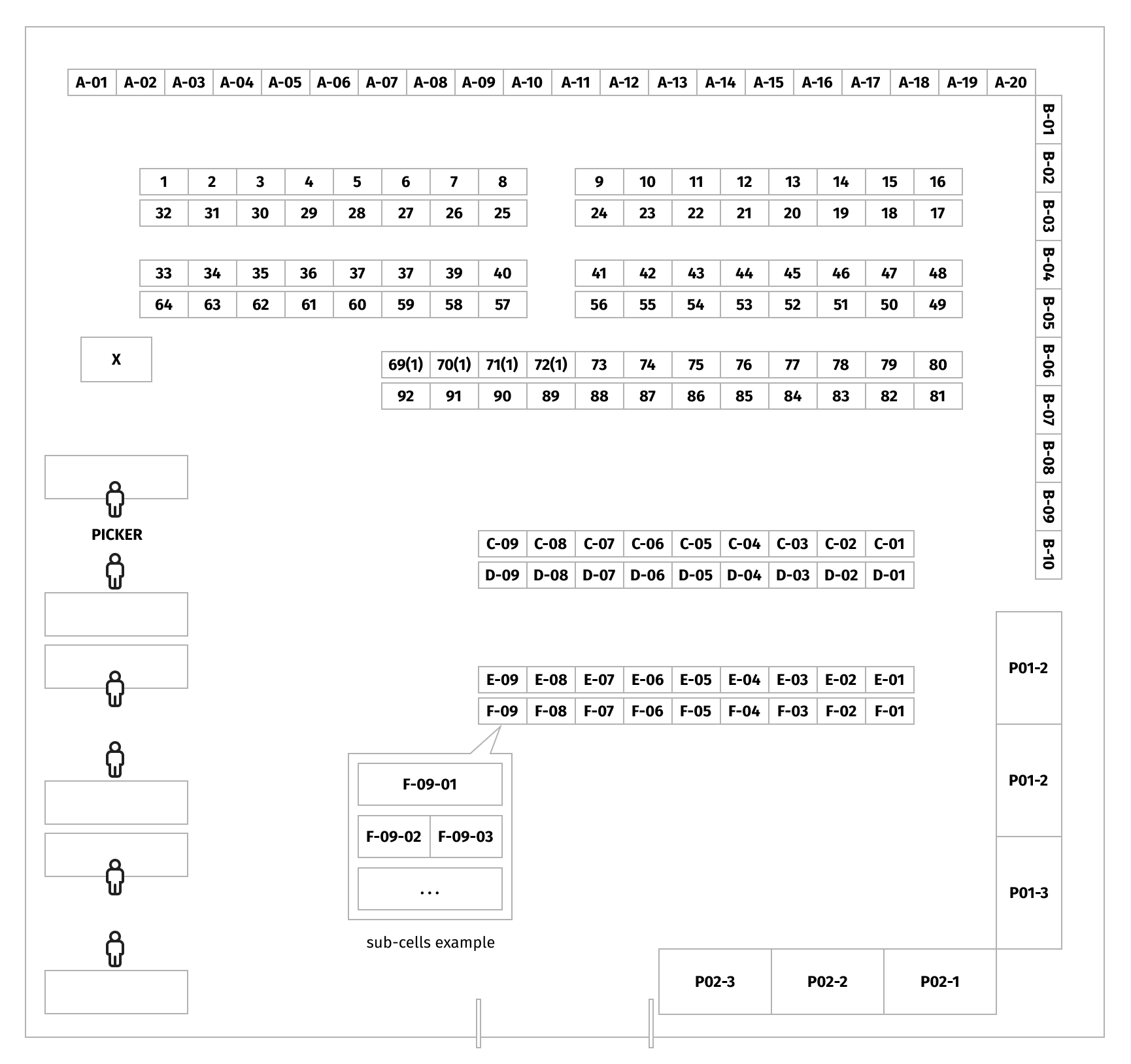
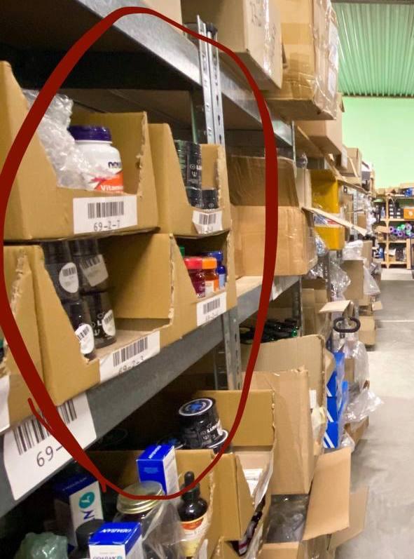
As you will see in the warehouse map below, product storage locations are grouped in rows, and every location has a dedicated identifier that consists of numbers and letters. Some locations have several levels (at different heights) and/or sub-cells. This means that several different products may be located at one cell/level/sub-cell. Locations with names starting with P are pallets, and a location named X is a refrigerator.
Particularities of our Business Case
After a discussion with the warehouse domain expert, we identified a set of limitations and suggestions that should be considered during our modeling:
- Products stored in the warehouse are low volume and light weight, therefore, product weight and quantity don’t generally delay collection time. However, some products have to be stored only on pallets or only in a refrigerator, so accessing and locating these products requires special treatment. For this reason, during our storage location assignment step, we decided not to move the pallet- and refrigerator-stored products.
- Sometimes it happens that for 1-2 orders a new collection is generated and processed, though generally collections contain ~20-30 orders. Such collections with a low number of orders may require special treatment.
- Because errors may occur during time logging (due to human factors or program bugs), it is important to filter out collections with anomalous order collection times. Details of filtering will be discussed in further sections.
- Every cell/sub-cell has a particular number of unique products. We consider that every cell/sub-cell can store at most the number of products that are placed there during the original setup.
- There is no limit to the number of products that can be stored in a pickers’ cart.
- Every unique product type is stored in one place only.
- Products required for picking are always available in the location they are stored.
- Order picking always starts and finishes from the same location on the warehouse map.
- The set of products available in the warehouse is constant.
Evaluation
The key metrics for measuring quality of OPT prediction are:
- MAE – mean absolute error: this metric was chosen because it is less influenced by outliers (compared to RMSE - root-mean-square error). Outliers appear in the data due to human error and other reasons. For example, if a worker is disrupted during the order picking process, or a product is missing, it causes a delay, but is not detectable from our data. MAE also intuitively translates into real life values, in our case – number of seconds. The lower the value of this metric, the better.
$\text{MAE} = \frac{1}{n} \sum_{i=1}^{n} |y_{i} - x_{i}|$
$y_{i}$ = prediction
$x_{i}$ = true value
$n$ = total number of data points
- Coefficient of determination R^2: the proportion of the variance in the target variable that is described from the independent variables by a model. The desired value of the metric is 1, but in the case of poor model fitting, computational definitions may yield negative values.
The key metric for measuring improvement of OPT in a new setup is:
- Average OPT improvement: average difference between OPT predicted in the original setup, and OPT predicted in the new setup suggested by the SLAP solution. This metric is used to measure the improvement provided by a suggested SLAP solution.
Predicting order picking time
If we are able to learn how to predict OPT from the historical data, we can draw insights on how different factors influence it. These insights will help us understand how we can change these factors to reduce OPT. In order to do this, we performed several experiments involving different approaches to creating features, data splitting, different ML models and target value transformation. We will discuss the best performing model below and mention some of the insights we gathered from other ideas and approaches.
Engineering a meaningful/representative feature:
As an input for the OPT prediction model, we used the number of products required to be taken from particular locations. This feature is a vector of 156 entries, where each entry represents the number of products required to be taken from a particular location. For example if we have a vector of zeroes, and in the 3rd position we have 1, it means that we need to take 1 product from location A-3. Sub-cell and location level are not encoded, because the number of samples/number of features proportion will be too low, and models will fail to fit, returning a negative R^2 score.
This feature is the most valuable for the order picking optimization part of the project, because every location corresponds to one entry in the above-mentioned vector. Other hand-crafted features we tested include: number of products to pick up on different height levels, number of products to pick up from cells with a particular number of neighboring products in the same cell, number of products to pick up from cells of a particular class, and others.
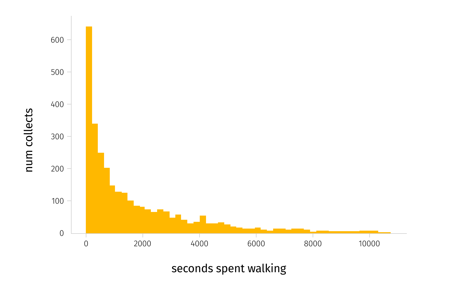
Using a Random Forest model with this feature as an input, we managed to achieve MAE of 11.4 mins. This means that our model produces an error of 11.4 minutes on average when trying to predict OPT on unseen data, which corresponds to a MAPE of 0.34. This result is valid in our case. In the distribution of OPT graph below, we can see that most of the collections in our dataset were collected in less than 30 minutes (~2000 seconds).
Optimization of order picking time
With a precise OPT prediction model, one can use it to get insights on what influences OPT including aspects related to warehouse layout. Thus, for the second part of the solution we use the model trained to predict OPT to estimate the improvement achieved by solving the SLAP problem with different methods.
Methodology
We use the same validation set that was used for measuring validation metrics in the first part of the project, but for a different purpose. First, we save validation predictions from our model for original setup features (original product storage locations). Then we solve the SLAP problem using one of the suggested approaches (change product storage locations) and generate validation predictions for a new setup. After that we compare the two predictions using the average OPT improvement metric explained in the Evaluation section. We tried 3 approaches to solving the SLAP problem:
- Alphabetical sorting. Sort products according to the frequency of orders in which they appear in the train set. More frequently appearing products are assigned to locations in alphabetical order before less frequently appearing products.
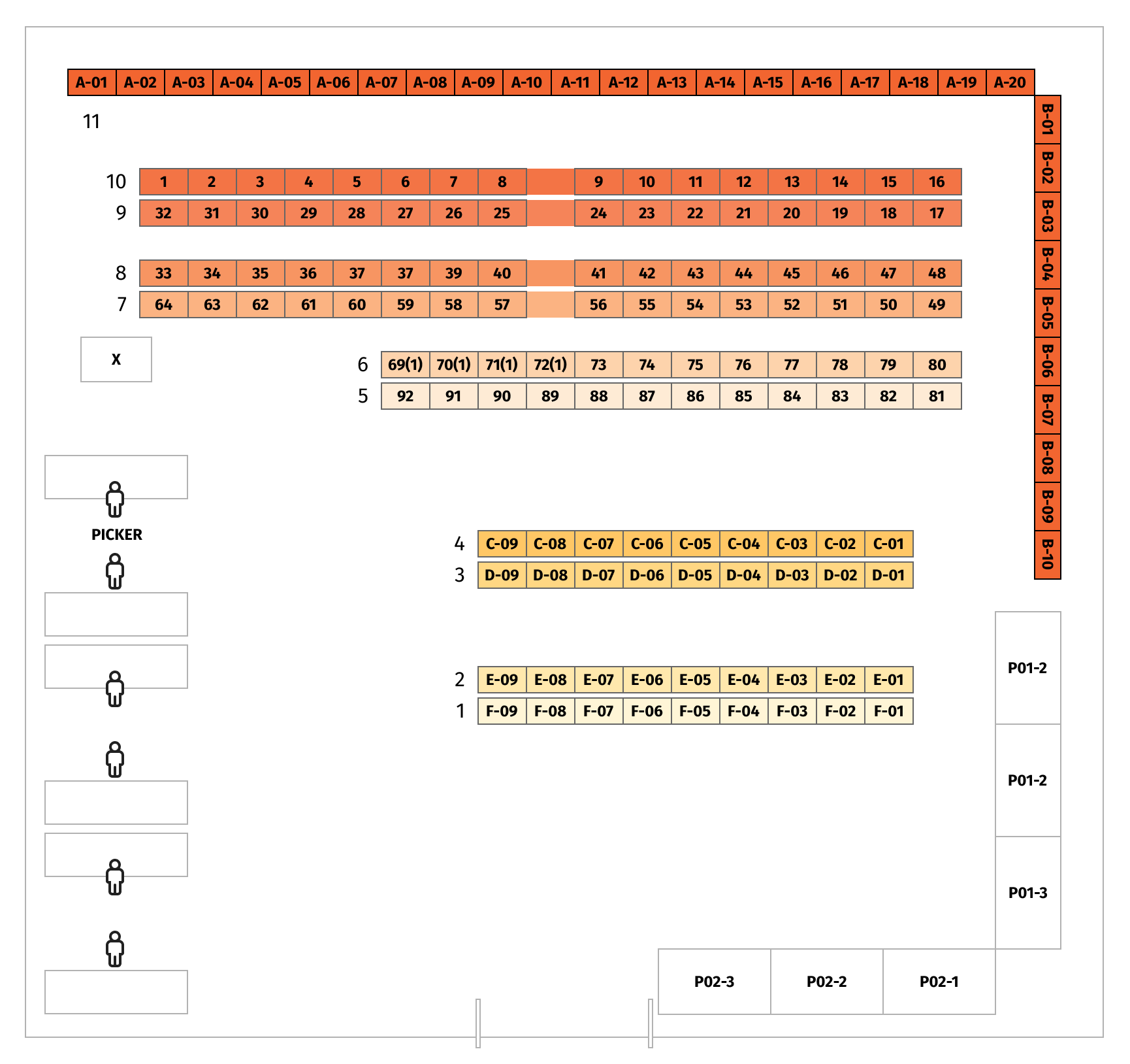
- Proximity sorting. Every row in the warehouse is a particular distance from the exit. Rows in closest proximity to the exit are thus stocked with products most frequently ordered, in alphabetical order, for easy access. A visual representation of row-clusters is displayed in the image below. Red rows are furthest away from the exit, so less popular products are placed there.
- SHAP-based sorting. This approach yields the most valuable efficiency improvement, but requires understanding certain concepts, which we cover in more detail below.
SHAP values
SHAP is a game theoretic approach to explain the output of any ML model. The SHAP method assigns to each feature an importance value (named SHAP value) that represents the contribution of that feature to the final outcome of the model.
Suppose for example that we have a model f(x), and that we want to explain the prediction of the model on a specific sample x*. To do so, the SHAP method decomposes the prediction into the sum of the contributions of all the features, namely:
$f(x^{*}) = \phi_{0} + \sum_{j=1}^{M} \phi^{*}_{j}$
where 𝜙₀ is the average model’s prediction.
To compute each contribution 𝜙ⱼ, the SHAP method relies on a concept that comes from cooperative game theory known as Shapley value. Shapley value is defined as the average marginal contribution of a feature value over all possible coalitions. Implementation of computing SHAP values for tree-based models is available in a python package called shap.
SHAP-based sorting
As was just explained, SHAP values represent the contribution of individual features to the final outcome of the model. The idea behind the values is to show how individual features shift the predicted value from the average prediction. In our case, the feature is the number of products required to be taken from individual locations, so we have 156 features corresponding to locations on a map, and SHAP values related to them.
Below is an example visualization of SHAP values for our Random Forest model. They are ordered according to their effect on prediction. SHAP values were calculated using the TreeExplainer class provided by shap python library. In this example:
- Feature 75 corresponds to the number of products in location 84
- Feature 98 corresponds to the number of products in location A-3
- Feature 26 corresponds to the number of products in location 33
Every little dot represents an observation. The horizontal axis represents the SHAP value, while the color of the point shows us if that observation has a higher (red) or a lower (blue) value, when compared to other observations.
In this example, higher values for feature 98 have a negative impact on the prediction, while lower values have a positive impact. Formally, it means that if we need to take a product from A-3, the OPT is expected to be smaller.
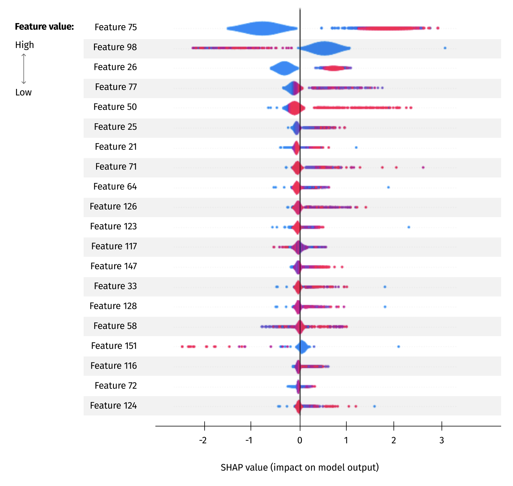
The suggested algorithm using SHAP values looks like this:
- Calculate SHAP values for every feature from the Random Forest model.
- Assign products according to popularity, placing more popular products in locations with lower SHAP values. According to implicit ML algorithm learnings, locations with lower SHAP values are the ones that pickers tend to reach the fastest. These locations are closer to the order picking start/end point or those with more convenient sub-locations.
The results
Average OPT predicted in the original setup was 22.8 minutes. The best average OPT predicted in the new setup with SHAP-based sorting is 17.5 minutes. This gives us a 5.3 minute absolute improvement, and 23% relative improvement. This improvement would be proportional at scale for larger warehouses. The new storage locations satisfy all the constraints discussed with domain experts, and can be implemented in real life scenarios.
Below we compare the results of some of the different approaches we tried.
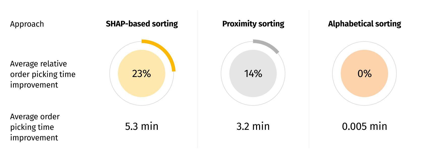
From the results, we deduced that product location proximity to the exit and to the order picking start point (in our case these are 2 different locations) influences the OPT. We also managed to identify more complex relationships using SHAP values to achieve even better efficiency improvements.
In order to gain more insight into where fast-moving and slow-moving products are located, we created visual representations for the proximity and SHAP-based sorting approaches below. Locations are framed in different colors based on the average popularity of the items located in them, where popularity was gauged on the frequency with which products were ordered during the observed period of time.
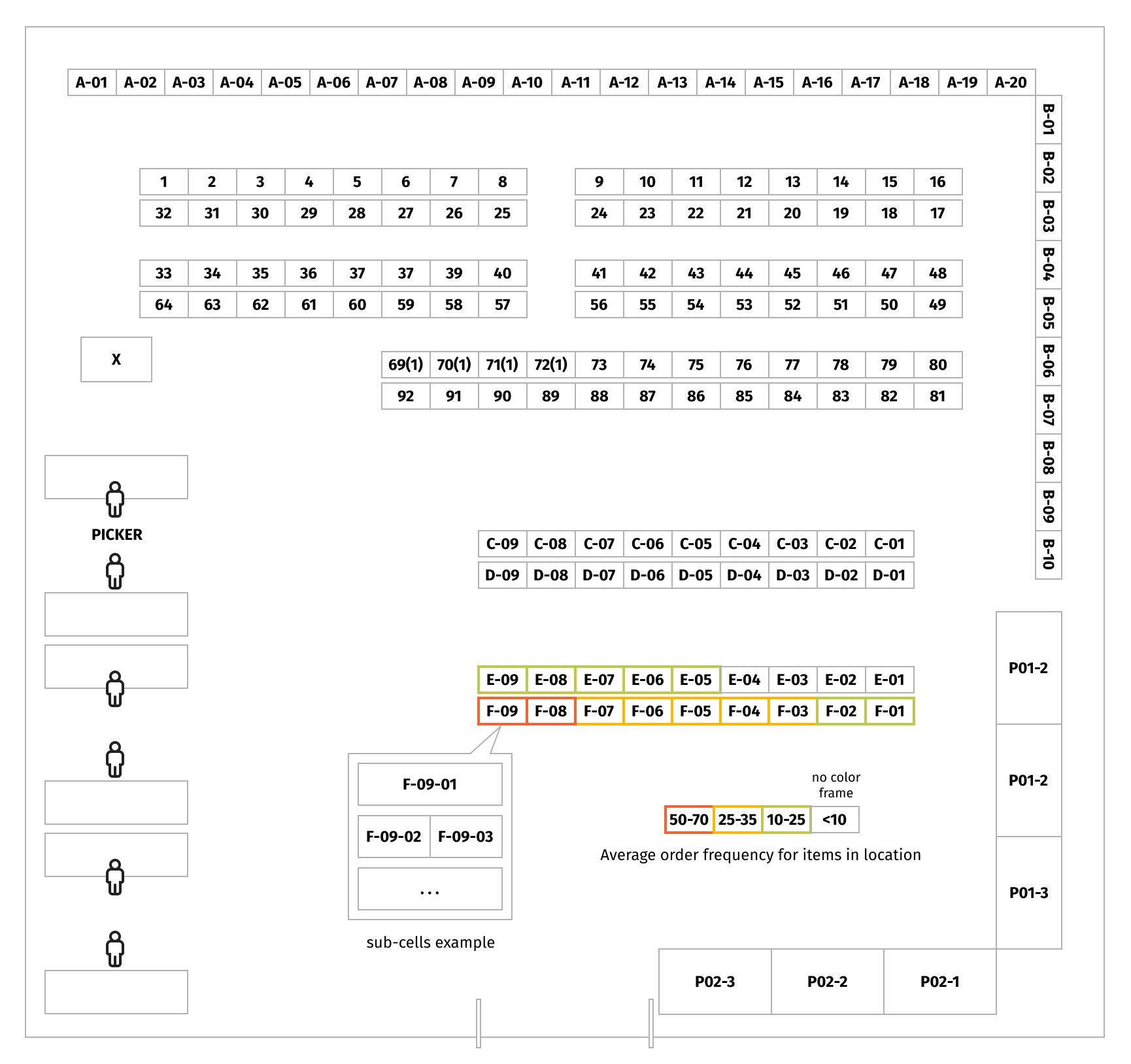
It is clear from the proximity sorting visualization that the most popular products are located in rows F and E because they are the closest to the exit from the warehouse. Since F-09 is the closest location to the exit, the fastest-moving products were located there.
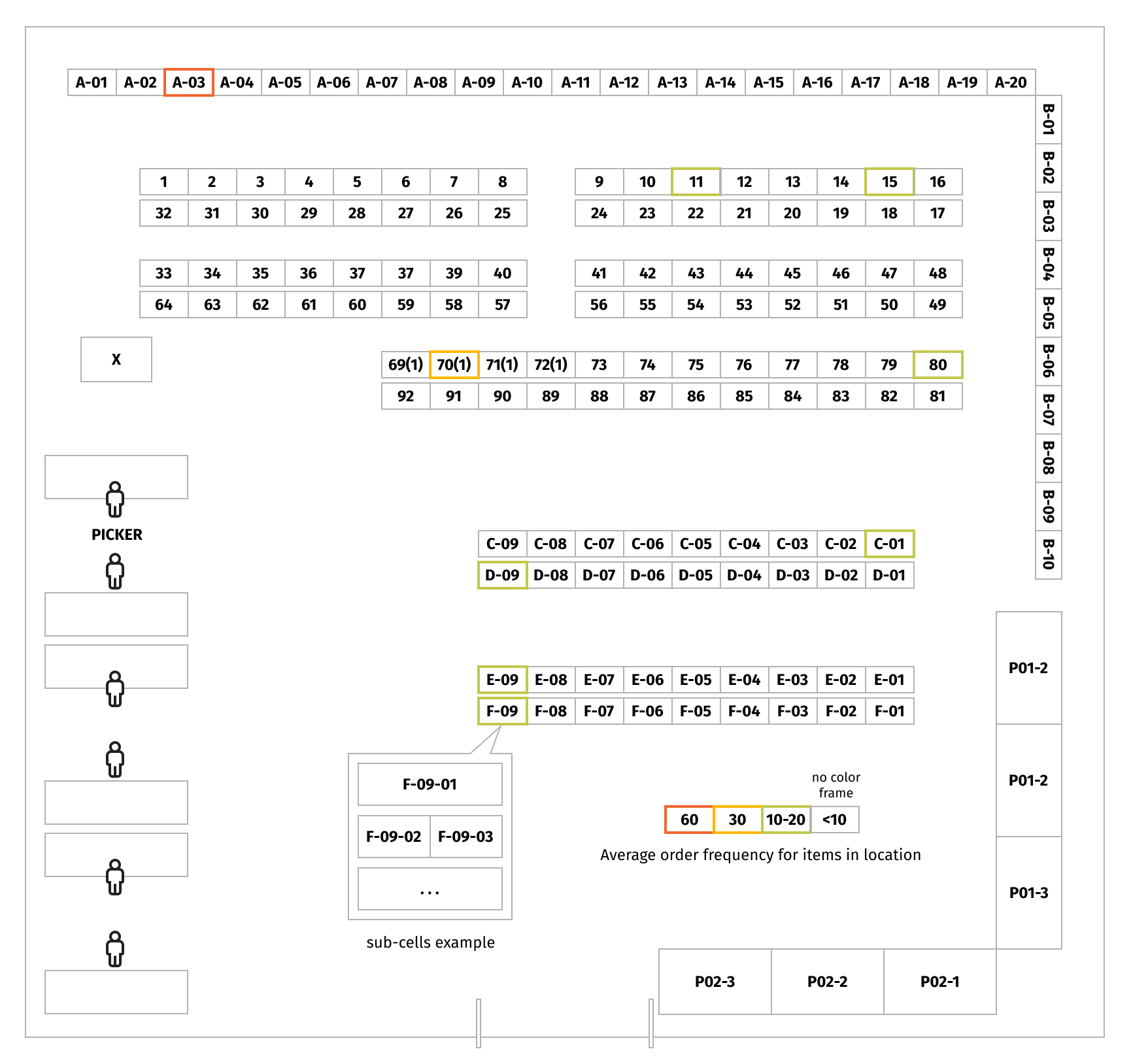
The SHAP-based approach used information that the ML model implicitly learnt about the locations from which products are picked up the fastest. From the visualization, we see that this approach locates the fastest-moving products in locations close to the ends of the rows. One of the assumptions for this could be that it is difficult for a warehouse employee to walk between the rows, hence, picking items from the middle of the rows increases the order picking time.
Conclusion
In this business case we have demonstrated how OPT in a warehouse can be improved by ~¼ with the help of explainable AI to solve a storage location assignment problem. Such logistic process improvement leads to a significant decrease in operational costs and increased order fulfillment throughput. Similar techniques can also be used to improve order picking time in different warehouse setups.

