
Improve website accessibility with these 6 simple tips
According to the 2022 Disability Statistics: Information, Charts, Graphs and Tables report, around 10% of the world population lives with a disability. People with hearing, movement, sight, or cognitive ability impairments require web applications without any barriers for communication or interaction. Moreover, issues with computer peripherals, such as mouse disconnection or touchpad absence, might limit the user's interaction with the application and force them to use the keyboard. That is why web application developers must adjust web apps to support accessibility.
In this blog, you’ll find useful tips for improving website accessibility that, in turn, will also help to increase the quality of your application.
Explore the web accessibility checklist we've comprised to address the main industry best practices:
- Optimize tab order for keyboard navigation
- Use semantic tags to structure the page
- Style to indicate focus on the elements
- Label and caption content
- Create responsive designs
- Use colors that contrast
Optimize tab order for keyboard navigation
By pressing the tab key, keyboard users can navigate through websites, moving from one interactive element on the page to another. This method enables them to easily navigate the site. When operating with the tab button, the order of switching elements (buttons, inputs, links, etc.) should be in top-to-bottom order to improve website accessibility. This way, the user will always know where they are in the app and where their next step is.
- Styles: Use float, opacity, order; flex-direction, etc with caution when using the Tab button since they can change the logical order of the elements on the page. Consider using visibility:hidden or display:none instead.
- Tabindex: Elements have tabIndex="0" by default. To make the element inaccessible via the tab button, it can be set to tabindex="-1". To set the element as the first in the tab order add tabindex="1" (but that is treated as an anti-pattern).
These principles need to be followed even for design changes and code refactoring.
Use semantic tags to structure the page
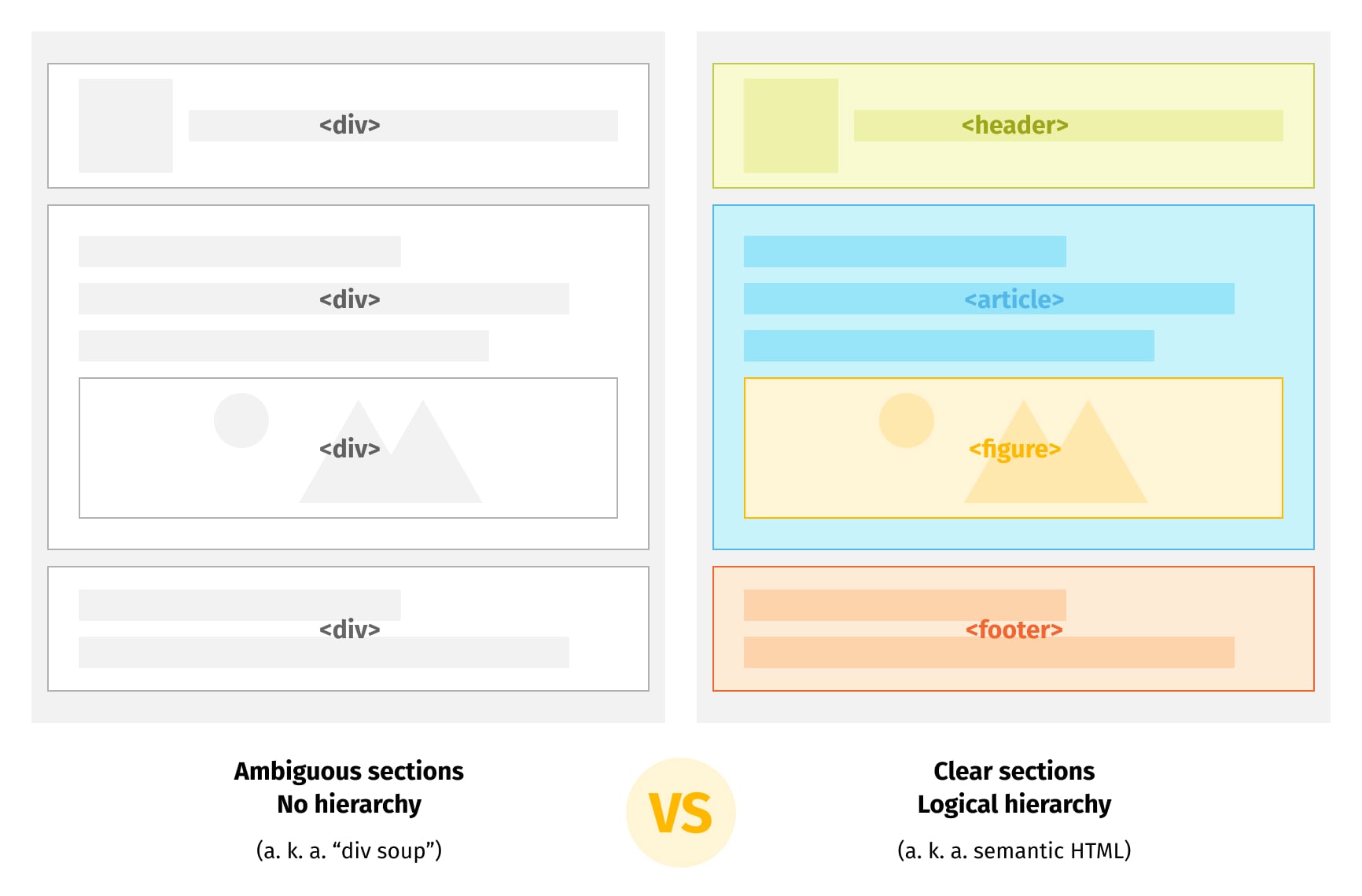
When structuring a page with website accessibility in mind, there is no need to ‘reinvent the wheel’ and omit browser-native instruments. A best practice is to use standard elements with built-in semantic tags and keyboard support rather than <div> and <span> elements. This enables developers to use out-of-the-box methods for interactive elements and increase website accessibility at the same time. So:
- For actionable button elements, use <button>, since it has built-in, clickable focus, disable, etc, properties.
- For navigation links, use <a>.
- Use headings hierarchically, with only one <h1> tag.
- Use main, nav, and aside because it helps screen readers to understand the structure and the main point of the page.
- When using <div> or <span> elements, specify the “role” attribute.
Almost all HTML elements have: “name”, “role”, “state”, “value” attributes, which are digested by screen readers. When a screen reader sees a semantically empty <div> or <span> element, it can remove such tags from its accessibility tree. Thus, considering adding the “role” attribute is a good idea. For example:
<div role="toolbar" class="toolbar">The content needed<div>
Focus styles - a highlight of website accessibility
A focus indicator serves as the equivalent of a cursor for users who rely on keyboards. By incorporating accessible focus indicators, you can enhance website accessibility not only for keyboard users but also for those who use assistive technology that simulates keyboard functionality, such as switch controls, mouth sticks, head wands, and voice control, among others.
A focus indicator highlights the currently focused items to improve the accessibility of the website. Here are some points to note:
- :focus-visible applies styles based on browser heuristics (not each time the element is focused). So if a user uses a keyboard to focus an item, the browser will apply the focus styles you will specify in focus-visible .
- :focus-within applies the focus to the element when the element itself or its children are focused on.
For example, the “outline” style in this case will be applied only when using a tab:

It will not, however, be applied when the element is clicked by using a mouse.

Label and caption content
Labels are important for website accessibility because they deliver additional information to screen readers. Below you will find some useful label and caption best practices:
- Each page, iframe should have a title.
- Images should have alts explaining what that image is about. It is acceptable to use empty alts if the image is used only for decorative purposes.
- Links should have descriptive text.
For example, instead of:
Check out our guide to web performance <a href="/guide">here</a>.
Use:
Check out <a href="/guide">our guide to web performance</a>.
- The form elements should have a label, especially inputs.
- “Aria-label” and “aria-labelledby” are both used for screen readers and both provide an accessible name for an element. The only difference is that the “aria-label” attribute takes text as its value and the “aria-labelledby” attribute points to another element in the document.


Create responsive designs
Responsive design is not just about improving speed or technical metrics, but also about making websites accessible and user-friendly. Below you will find some tips that will help your readers easily operate, navigate and stay longer on your website.
To make sure the website meets baseline accessibility, always start by setting width=device-width and initial-scale=1 in a head with meta tag:
<meta name="viewport" content="width=device-width, initial-scale=1.0">
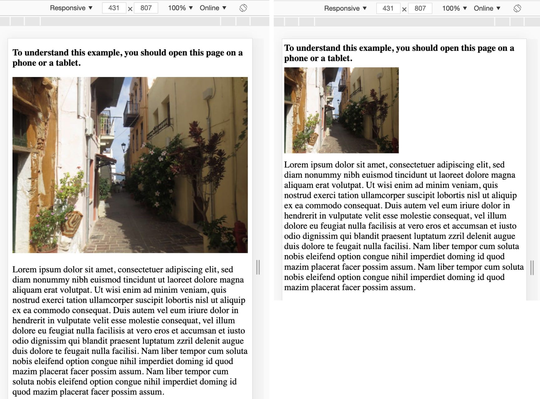
- It is recommended to use rem/em for fonts instead of using pixels. When using px units, you prevent the text on the website from being resized (adjusted properly) when a user changes the default font size.
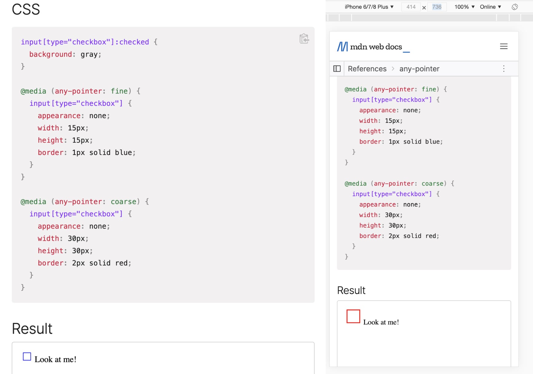
- A minimum recommended touch target size is around 48px. Elements smaller than that can be hard to tap or click. If there is a need for smaller interactive elements, media query any-pointer: coarse can be used.
Observe how “Look at me” appears on 1) desktop and 2) mobile:
Use colors that contrast
Color is important not only for people with disabilities, but in general because it can affect how people perceive information.
Currently, color contrast is computed via Advanced Perceptual Contrast Algorithm (APCA) to make an accurate estimation of human contrast perception. By opening a developer tool and clicking on the color, you can check whether the contrast ratio is ok or not.
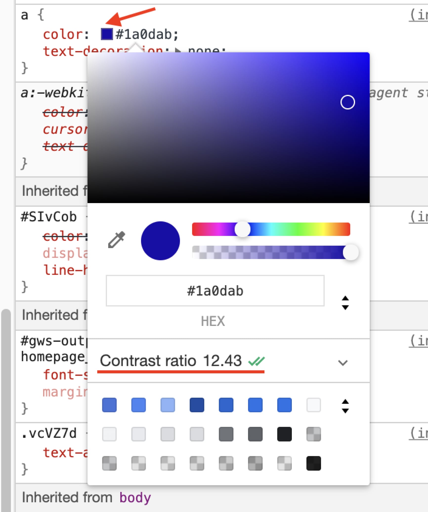
When displaying information to a reader, it’s important to not only rely on color because poor contrast ratio or small font size can make it difficult for users to read. It is recommended to use text or other visual elements together with colors to display critical information.
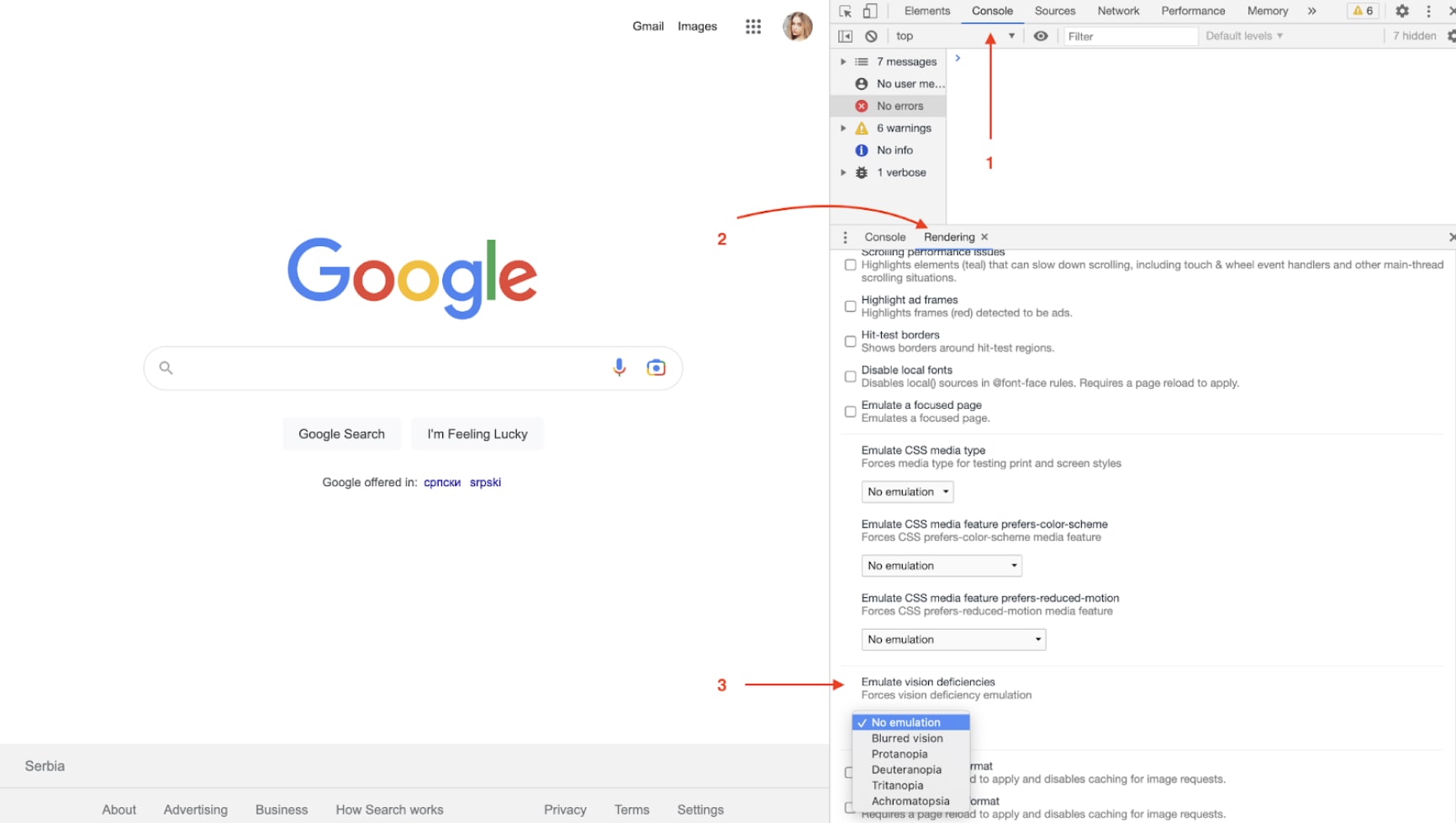
Further, you can emulate vision deficiency for a website to understand how different users are able to view and interpret information visually. To do this, you need to open the developer tool, navigate to the Console tab, and Rendering subtab, where you will be able to select the Emulate vision deficiency option.
Conclusion
Following the website accessibility best practices described above will not only accelerate website performance and optimize technical KPIs (which is a big advantage), but it will also improve website accessibility and help users navigate and interact with your website with greater ease.
Get in touch with us to chat to a UI expert on our team.
