Data quality monitoring made easy
Having complete control over data quality can seem daunting and prohibitively expensive. But is that really true? Is it as difficult as it seems?
There are many tools out there in the marketplace to help with data quality, but it’s true that many of them are pricey, have a steep learning curve, and force you to change the way you work with data. On the other hand, freeware tools assume that you know for instance, Java, Scala, or Python and that you’re happy to rewrite code and recompile and redeploy the system any time you want to add a new rule to the data quality process.
In this article we’ll show that although controlling data quality can be complex, the first step - data monitoring, doesn’t have to be. It’s both affordable and relatively simple to perform and can lead directly to improving the overall health of your business.
Factors that complicate data quality
Firstly, let’s break down data quality into three distinct parts:
- Data monitoring
- Data inspection
- Data cleansing
Data monitoring is a practice that helps ensure the data you have in the system or are about to add is correct. It also helps to gather metrics about this data (data profiling). The combination of rules and alerts works to let you know if there are errors in specific data sources, tables, or columns. It does not however, identify errors down to the row level.
Data inspection helps you to classify the data into several buckets. The first bucket is correct data that passes all quality criteria. This data can be used safely for further calculations and analytics. The second bucket is duplicated data that can be ignored in future during calculations and analytics. It can even be bypassed and no longer stored in the system in order to free up disk space and decrease data processing times.
Next, there is incorrect data. This data cannot be used in analytics because some key attributes are missing. While it needs to be excluded from further analytics to prevent getting incorrect results, you’ll likely want to retain this data for further investigation.
Finally, there is damaged data. It’s partially broken or incomplete data that misses important but non-essential parts. The difference between incorrect and damaged data becomes clear by using an email archive as an example. Email without a sender and recipients (incorrect data) is mostly useless, but email with a missed attachment (damaged data) while essentially being broken, can still be considered useful.
Using a data inspection approach can narrow the root cause of an error to specific rows in data as well as providing an understanding of which rules have been violated.
Data cleansing is a set of practices that helps provide suggestions on how to best fix broken data or may in some cases even perform these fixes automatically. However, to get to that point you first still need to go through the data inspection step.
The deeper you need to understand exactly where an issue is, the more effort is required. And data monitoring is the data quality approach that requires the least overall effort.
Business rules vs technical checks
All checks that can be done on data can be divided into two categories; technical and business checks. Technical checks are usually easy to create and quick to apply, however they’re limited in what they can test. Typical technical checks include looking for duplicates or null values, controlling counts. and frequency of data updates or similar.
Business checks are more complex. It’s hard to create common patterns for them because it can be difficult to predict data formats, detalization levels, and correlation between fields. The more business checks you look to add, the larger the effort needed and the more knowledge about the data is required.
V-factors of big data
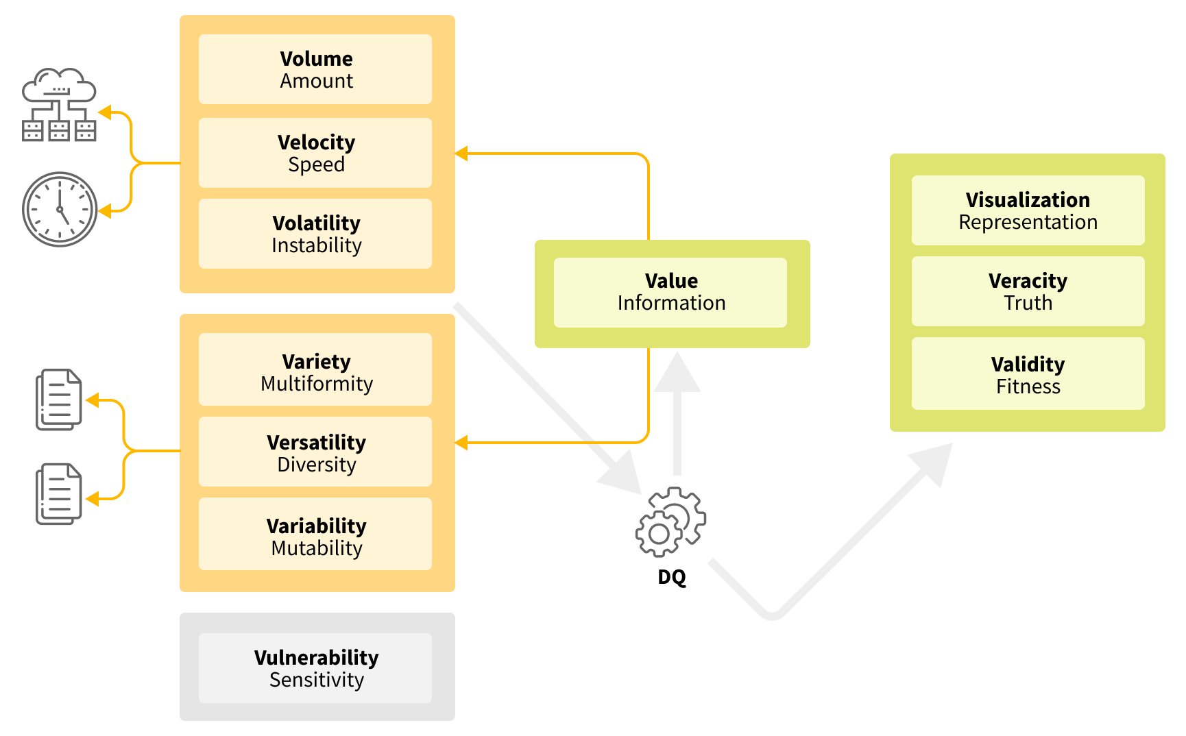
Another reason why some people think ensuring data quality is a complex task is that data has a lot of characteristics (aka the V’s of big data). As indicated in the figure below, there are up to 11 identified V’s that can exist in a variety of combinations. Each of these factors affect the complexity of data quality detection. Let’s explore how:

Volume - the amount of data.
Velocity - how quickly the data arrives and how much time you have to process it.
Volatility - how often the data changes or becomes outdated.
Variety - different data sources and formats.
Versatility - different business entities and domains.
Variability - the rate that data formats and meanings change over time.
Vulnerability - how sensitive the data is or how carefully it needs to be worked with.
Value - the meaningful part of the data.
Visualization - the degree with which the data can be visualized.
Veracity - the reliability of the data and the level of confidence you have in it.
Validity - whether data is damaged or not.
From the list above it’s clear that data quality practices should reveal the data validity and veracity. Visualization is also an essential part of any data quality framework. So these V’s do not affect the complexity of data quality measurement.
Volume, velocity, and volatility influence computing power and time as well as the number of checks you are able to apply against the data.
Variety, versatility, and variability influence how many checks you can create for the data. And which specific efforts are needed to do that or to maintain the rules used to check the data.
Vulnerability itself does not directly increase the complexity of data monitoring. At Grid Dynamics, we mostly work with some select metrics and provide some aggregated output. However, if we want to go deeper and do data inspections then the sensitivity of the data needs to be taken into consideration.
The last V-factor, value, is very interesting. It represents the quantity of information in the data. It can be estimated during data quality checks and can also affect other V-factors.
Let’s consider the example of someone working with an internal Salesforce database. They know there are dozens of tables and some of them have hundreds of columns. But in reality we’re only really interested in between 30 and 50 of them. Sometimes there is another V-factor (verbosity) which is used to show how redundant the data is. So this example shows how value can affect volume. On the other hand, the value of some data can be changed after data quality checks so that duplicate data is removed and incorrect data rejected.
Data quality goals
Before exploring the details of potential solutions, let’s summarize what the expectations are for a data monitoring solution:
- Easy to install
- Easy to integrate into the data processing pipelines
- Shouldn’t significantly change the current approach of working with data
- Easy to configure
- Easy to create rules to check the quality of data
- Easy to visualize results
- Provides an answer to the question of “whether the data is good enough right now?”
- Works quickly
- Raises alerts when an issue is detected
- Safe and secure
Some additional expectations that are more complex could include:
- Able to generate rules
- Provides the ability to detect the root cause of issues
- Supports data sampling
As we’ve discussed above, the task of data quality monitoring can be quite complex. But who said that the solution also needs to be complex?
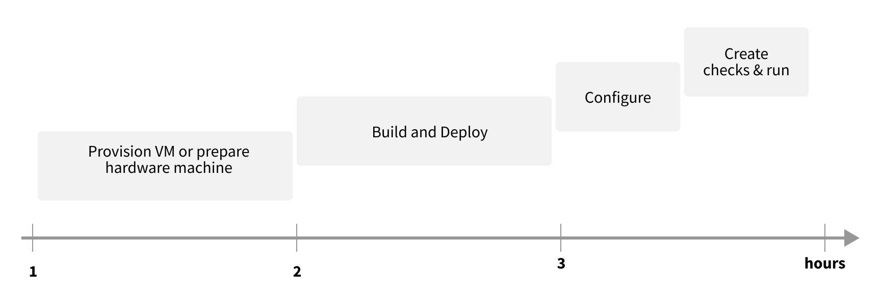
At Grid Dynamics we have created a lightweight solution that allows us to set up regular and automated data monitoring with initial basic checks done within a few hours.
Architecture and integration

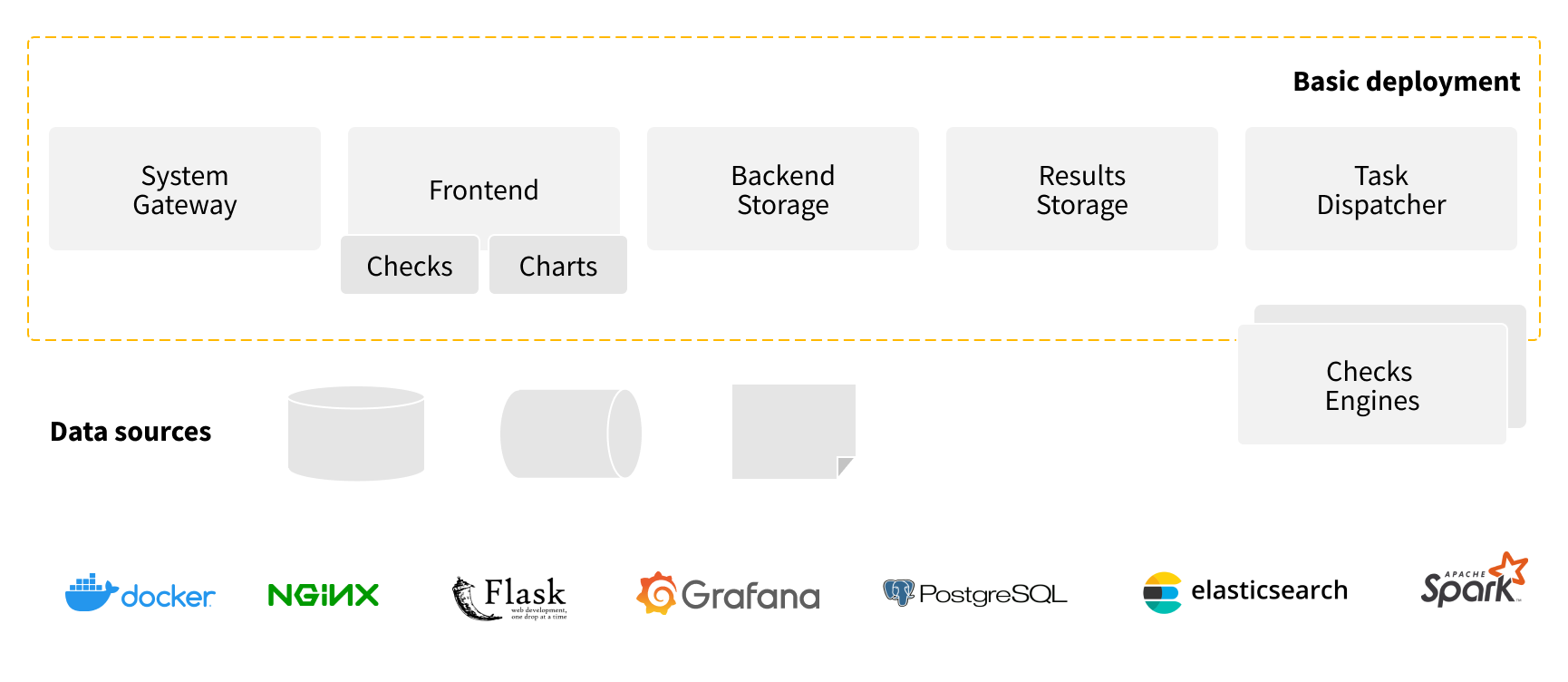
The architecture shown in the figure above is for a basic deployment such as that used for showcases and workshops. Out-of-the-box it supports connections to Data Storages that support JDBC connectivity, files like CSV and Parquet, and demo-mode for Kafka-streams.
The other components of the technology stack are:
- System Gateway: Nginx
- Frontend: Python/Flask
- Charts: Grafana
- Backend: PostgreSQL
- Results Storage: Elasticsearch
- Task dispatcher: Apache Livy or Spark client
- Check Engines: target DB cluster, Spark cluster, Amazon Deequ.
Integration of the workshop version takes only 3 hours from nothing to something.

Further integration is possible and can include: integration with current data pipelines, attaching additional sources, integration authentication system and log management, BI systems, and wrapping existing DQ tools, among others. Of course, the more check rules you’d like to have, the more time is needed to create and tune them.
For more details in this area we’d be glad to do a live demo and discuss the specifics of your data.
Solution features
Now let’s explore the features of our solution and how each of the expectations outlined previously are addressed.
- Easy to install
- The Docker based environment requires just one host, e.g. t2xlarge on AWS for the base installation or weaker if you are using your own Spark cluster.
- Less than 30 minutes to build and deploy the basic image.
- Cloud agnostic.
- Easy to integrate into the data processing pipelines
- The solution does not assume any specific scheduler to be used. You are free to use cron, Jenkins, Airflow, or other schedulers.
- The simplest interface to run a set of checks is to do 1 API call.
- Shouldn’t significantly change the current approach of working with data.
- The solution supports the Sidecar pattern, so initially it could be set up in parallel with main data pipelines.
- If you want deeper integration into data pipelines and have the ability to stop bad data from spreading, you should add data monitoring tasks into your pipelines.
- To simplify the task we have a set of templates that can be used to generate code for Airflow or AWS Lambda or whatever you want.
- Easy to configure
- Basic functionality assumes connection to any DB that supports JDBC, several files-based data sources, and Kafka-streams.
- Any other datasource can be attached by writing a specific data-connector or custom connector.
- Easy to create rules to check the quality of data
- The only knowledge that is needed is knowledge of SQL.
- The solution also provides an ability to create templates, so they will be reused in the future even without SQL knowledge - you should just parametrize it.
- If you have your own tools or scripts you would like to add to a data monitoring assessment, it’s supported by the solutions as well but does require scala-coding.
- Easy to visualize results
- Grafana is used to visualize results.
- It’s embedded in our solution to avoid questions like, “where is the chart for this rule?”.
- Provides an answer to the question of “whether the data is good enough right now?”
- Generates a report that represents the current state, rather than just providing charts.
- Works quickly
- It depends on rules and the V-factors of the data.
- Raises alerts when an issue is detected
- The Grafana is used for that.
- Safe and secure
- The solution requires only R/O access to data.
- Authentication can be turned on on the gateway side to limit access to the system. Some standard authentication providers like LDAP, OAuth and so on are supported.
- Generally, data monitoring is about gathering metrics about data, so there shouldn’t be any sensitive data in results storage, only metrics results.
Examples
A picture is worth a thousand words, so let’s now go through several examples. To reduce data complexity, let’s look at climate data that can be requested from the National Climatic Data Center (NCDC). Namely we will work with historical temperature data (dry and wet bulb) and wind data (direction and speed).
In pic. 4 below we’re just visualizing aggregated (min and max) values of dry and wet bulb temperature and this is enough to see that sometimes we will encounter abnormal values.
As you can see on the chart above, there are upper and lower boundaries (red horizontal lines), so it’s pretty easy to see when values are outside of them.
Another approach is to use statistics and calculate the standard deviation of dry and wet temperatures (pic. 5). In this case, we can draw a 3-sigma corridor and see the values that are outside the boundaries that most likely indicate abnormal values.
This is how it looks in our system:
Now, let’s switch to the wind measurements. It’s pretty obvious that if there is some wind, it should have values for both speed and direction. If it is calm then both values will be zero. But if we just visualize the measurements in the same way that we did with the temperature, we won’t get a useful result (pic 7).
So instead, let’s look at only the points where our data has only either a direction or speed value that is incorrect (pic 8).
That looks better. We can even try to add some threshold (brown area). But how often do we have such a discrepancy? We can probably just disregard them. To see that, we can calculate the number of measurements we have (total_count) and the number of measurements where we have a discrepancy (bad_count). This is represented in picture 9 below.
Wow, 25 percent of bad data! We obviously can’t simply disregard it. So now it's time to start writing that angry email to the data provider asking them to fix the data or the way they source it. But … hold on. Let’s add one more data monitoring check - let’s compare what we have in our system where we have 25 percent bad data with the system of record, which are the original files we get from the data provider.
This is an example of data profiling. We will profile the data in two sources and then compare that aggregated knowledge about our data.
The following characteristics can be profiled both for wind speed and direction (measured as an angle from 1 to 360 degrees, 0 - means “no direction”).
| Total count | count(*) |
| Positives count | count(*) when > 0 |
| Negatives count | count(*) when < 0 |
| Zeros count | count(*) when = 0 |
| Nulls count | count(*) when is NULL |
| NaNs count | count(*) when isnan() |
At the end of this process we will have the following picture (pic 10):
The bronze charts are for the wind direction and the magenta ones are for the speed. We see no differences in the speed data but see exactly 611 items that are placed into different buckets. 611 is the number of our bad data (see picture 9 above). In the master data source they are placed into the NaN bucket but in our system they are in the NULL bucket.
So, we’ve ultimately found out what the issue is - it’s our ETL process that is incorrectly extracting the data from the data source. Unfortunately (or fortunately) nature is often very complex and sometimes the wind has variable directions that are represented in real data with the abbreviation ‘VRB’.
Now we can postpone writing that angry email to the data provider and direct it to the team responsible for data ingestion instead. Moreover, we have detected a more serious issue with our data schema that expects the wind direction to be an integer value that represents the exact azimuth. Solving that particular issue moves beyond the scope of this investigation, which has now reached its end.
As we’ve seen, a picture is indeed worth a thousand words … but a live demo is better than a thousand pictures. Request it, it’s free. You’ll see that setting up regular data monitoring for your data is perhaps not as complex as you might have imagined. It’s also more affordable and faster to initiate than you’d expect.
