The key to a high app rating? Low crash rates and a clean, modern UI
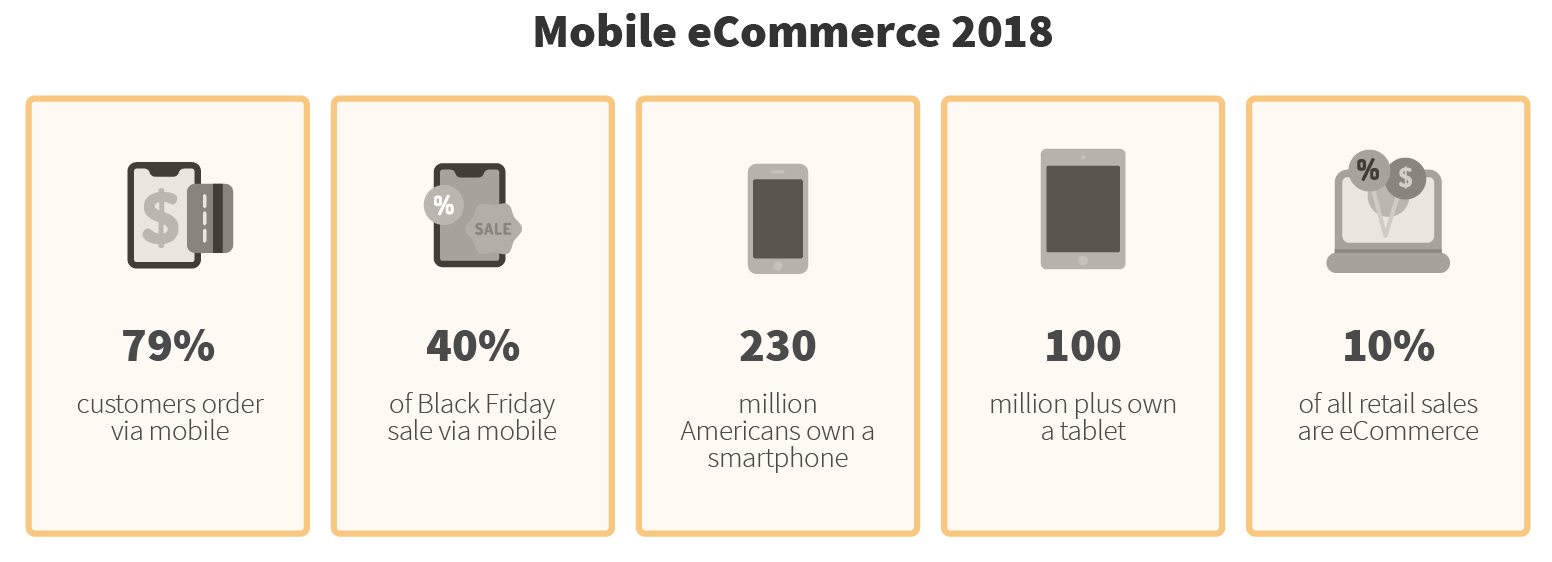
Many large brick-and-mortar retailers lack a strong mobile app experience, which is a problem on days like Black Friday and Cyber Monday, when online traffic soars. In the 2018 holiday season, 79% of all purchases involved a mobile device - this includes customers that made a purchase, looked up products, or checked promotions. Overall online sales rose by over 16% in 2018, 40% of which were on a mobile device, all while in-store sales fell by 7%, indicating a shift to online channels.

Given how much holiday season traffic involves a mobile device, if a retailer’s mobile experience isn’t modern and seamless, they stand to lose a great deal of revenue, particularly during the peak season. We worked with one large retailer who was worried about their app for the upcoming holiday season, as its performance was inadequate and unstable. It had a high crash rate,it downloaded slowly, and had negative reviews from customers. They realized that they had to make significant changes if they wanted to boost mobile revenue and get ahead of their competitors during the holiday season.
Solution: focus on crash rate and stability
The retailer knew that they had to have a strong experience for online, store, and mobile shoppers for the holidays, but especially wanted to encourage mobile interactions. To do so, they needed to improve their mobile app to generate higher ratings before Black Friday. They decided to focus their energy on two areas. First, stability. They believed an app that remained stable at all times would increase ratings. Second, appearance. They wanted a clean, modern feel . In particular, the home page is the first view a user sees of the retailer’s brand. It is also the page the user will continually visit during their shopping experience. Additionally, the retailer wanted to invest in automated delivery processes to release updates more quickly.
Seeking assistance with their mobile app development, the retailer brought in Grid Dynamics, an engineering services firm that had produced award-winning results for other large retailers. Grid Dynamics was especially adept at building CI/CD pipelines and QA automation for mobile testing, both of which were crucial elements that the retailer wanted to put into place. Grid Dynamics assessed the challenges that the retailer was facing, and then laid out their solution, providing several recommendations.
Challenges: lack of automation, and monolithic architecture
Generally, we start all of our projects with a discovery phase in order to determine the client’s situation, and plan a course of action. In our assessment, the first problem that we discovered was slow development due to manual testing. This meant finding test use cases manually, and then building each test individually. This process took a long time, and the lack of automation meant that many use cases slipped through the cracks. Therefore, not only was test coverage slow, but it was also incomplete.
The second significant issue was with the app’s architecture. It was difficult to test due to a lack of separation between the layers and frameworks. This monolithic structure had resulted in a large app with many redundant and out-of-date files. The sheer volume of code made it difficult to test and navigate, allowing for errors and bugs to remain undetected.
Finally, the combination of the architecture and manual testing issues meant that the user experience wasn’t quite what it should be. The UI, in particular, had some persistent bugs which frustrated users, impacting user ratings and keeping sales low.
Based on this assessment, we came up with a strategy to improve their mobile app:
- Implement a CI/CD pipeline and automated testing to speed up development.
- Institute modern architectural processes to clean up the app, enabling easier testing.
- Provide new features and redesign the home page to better satisfy customers.
Now, let’s dive into the details of our technical solution.
Build CI/CD pipeline and automated testing
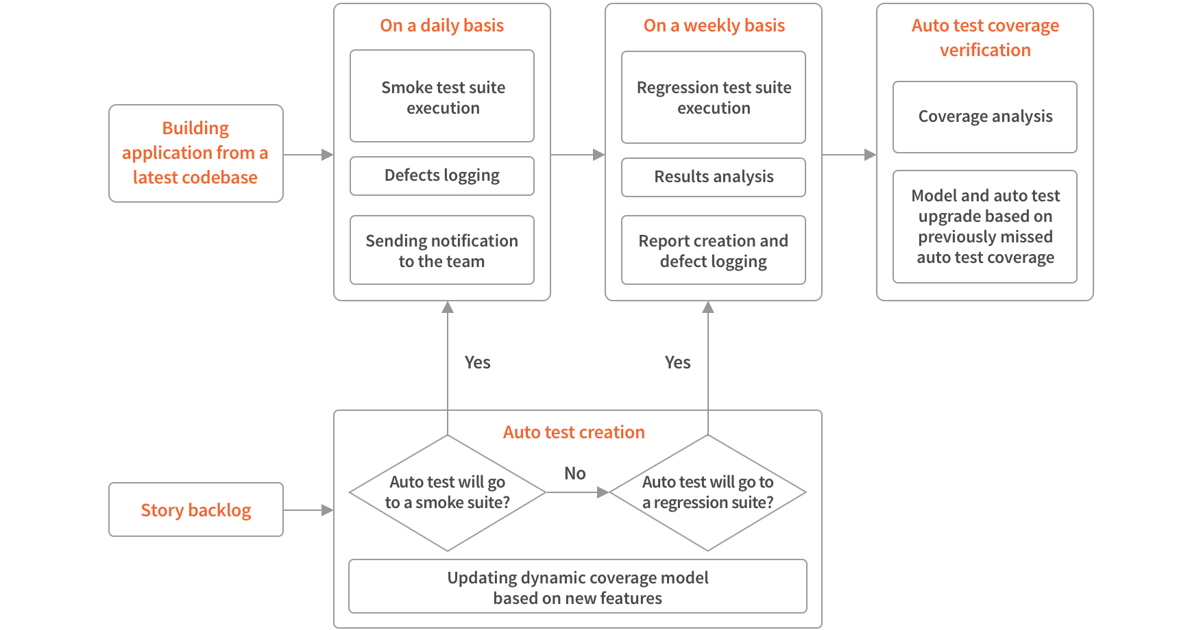
Our first step in fixing the mobile app was to transition the client from manual to automated testing. Our initial goal was to ensure that every basic function worked without fail, and to immediately know how new changes affected our build. To accomplish this, we implemented a smoke test automation suite that would test major functions daily, and a regression suite that would test older functions weekly. These suites guaranteed that major app components worked on a regular basis, and operated without any human involvement.
After we ensured the performance and quality of the app as a whole, the next step was to set up a testing platform for the app’s individual functions and corresponding UI. Initially, there were hundreds of UI test cases that were tested manually. Both sonar analysis and internal testing lacked automated testing as well. To correct this, we built a CI/CD pipeline that could run all of these tests, and publish builds for internal testing. With the time from commit to production down from weeks to hours, we turned to improving the test coverage.

At first, we measured coverage by the number of automated test cases, compared to the number of total manual test cases. Due to the size of the project, many use cases missed by the manual QA team would never be found, and thus would never get automated. Therefore, we built an alternative method to show test coverage, which we thought would increase the quantity and quality of coverage:
- Create a model of an iOS application in our test framework.
- Check if every element was covered during the test/suite execution.
- Show the results of the coverage: for example, if there are 50 elements, and 30 of them are hit by the tests, the mechanism would say that the coverage was at 60%.
Ultimately, we were able to automate many manual UI test use cases, speeding up testing and ensuring coverage was thorough. Additionally, with the CI/CD pipeline, we were able to fully automate the retailer’s development process.
Construct new architectures and clean up the app
With our new and improved test coverage, we were able to focus on bringing modern architectural practices to the client’s app development. The previous architecture was monolithic, and difficult to separate into frameworks and layers for testing. We implemented newer architectures based on MVVM (Model–view–viewmodel) and MVP (Model–view–presenter), which are far more testable, leading to a significant 25% increase in unit test coverage.
Bringing in a new architecture allowed us to remove dead weight from the app. We identified superfluous code and cleaned up the resources, which reduced the size of the frameworks. Initially, the app contained thousands of files. We were able to reduce the number of files by 40%, and the number kept shrinking due to our adding of feature-based frameworks for all new features. By the time we were done with our main cleanup, we had reduced the size of the app by 60%, so that it both took up less space on user’s phones, and became easier for us to manage.
We also sped up development by reducing the project’s repository size. First, we removed third-party libraries from the repository, and moved them to Amazon’s s3 storage, adding support for versioning. Then, we added support for the Carthage dependencies manager, which made it easier to share and reuse code that we had already written. Through these measures, we trimmed down the time it took to clone the repository from 10 minutes to just 40 seconds.
Improve UI by redesigning the home page and creating a new checkout process
Another important implementation we made was simplifying and enriching the app’s homepage, as these pages are critical to a positive customer experience. The homepage is the customer’s first impression of the app.. Therefore, we built a homepage that was easy to navigate, pleasant to look at and quick to load, hoping that a positive first impression would lead to higher app ratings and more purchases.
Another crucial element of a retailer’s app is the checkout experience. We built a new customer checkout platform with superior open source integration, streamlining the experience and removing bugs that had plagued customers. For example, carts had previously doubled in size for no reason, and sometimes coupons didn’t apply correctly. Issues like these frustrated customers and resulted in lost conversions, so we made an effort to keep the checkout bug-free, and easy to use.
Results: stability and clean architecture pays off
The results of our testing automation and other app implementations were highly positive. The crash rate of the app, which had been quite high after iOS 12 was released, was reduced by almost 98%. The 25% increase in unit test coverage led to a smoother launch, and a decrease in bugs. Meanwhile, the homepage impressed customers, and the average rating on the app went up. The changes to the checkout cart also brought notable benefits, as conversion rates increased as well.
Most importantly, the retailer had well over 250,000 app downloads in the three weeks leading up to Black Friday. This placed them in the top 10 in downloads among retail apps on iTunes, an impressive feat for a retailer that still has a large presence in brick-and-mortar stores. With increased downloads and better ratings, the retailer’s bid for an improved holiday season proved successful. With a CI/CD pipeline, clean architecture and automated testing, they are better set up for future updates, development and new features as well.
Conclusion: we can bring similar results to other retailers
Smart retailers have determined that mobile is the future of e-commerce, and are making their mobile apps a priority. One of our large retail clients used our experience in DevOps and testing to simplify and strengthen their mobile app before the holiday season. They were rewarded by being placed in the top 10 downloads for retail apps in the iTunes app store. With clean architectures and automated testing, a stable, easy-to-fix mobile app is a possibility for all retailers. If you’re a retailer looking to improve your mobile app, contact us and we will be happy to help!
