Using Next.js image component to improve website performance
In this article, we’ll be discussing Next.js image component usage and the performance and accessibility benefits it offers. So if you’re interested in improving the performance of websites and want to learn a bit more about how this component works under the hood, then you’re definitely in the right place.
Introduction: How images impact performance
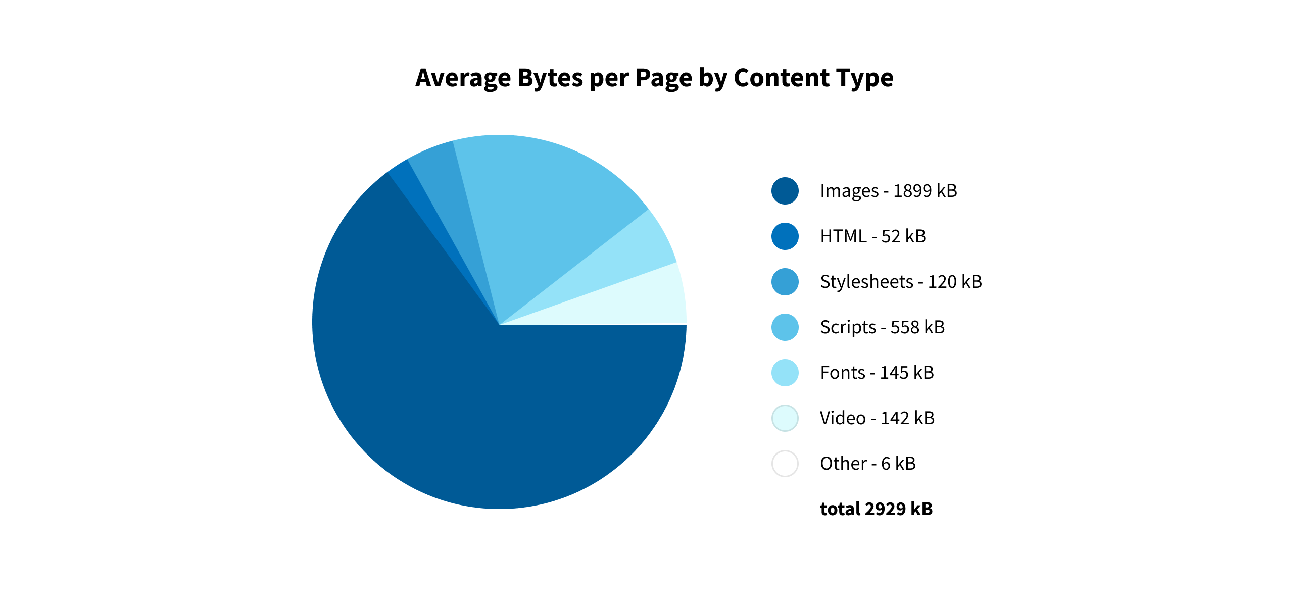
Creating a website full of beautiful images, whether for presentation, blog, news, or e-commerce needs, has become standard in modern web design. However, it often comes at a cost to performance. This becomes clearer once you consider that images take up around half of all the data loaded on the web. It's also important to consider that Google has stated since 2010 that page speed influences their rankings. So image bandwidth is clearly a very important issue.
As you can see in Figure 1 below, images on average take quite a substantial amount of total network bandwidth:

Why we need to solve image performance issues
The problem of image-related performance in web development isn’t a new one. It has in fact been a major bottleneck for over a decade. Even though there have been numerous attempts to reduce the impact images have on loading times, none of the solutions developed have satisfied all the aspects of the problem.
Over 10 years ago, Amazon did a study in which they found that every 100 milliseconds of latency cost them a 1 percent decrease in sales. Google reporting shows that an extra 0.5 seconds in search page generation time dropped traffic by 20 percent. And if we take a look at a study from Akamai done in 2017, it shows that every 100ms delay in website load time can hurt conversion rates by up to 7 percent. These findings clearly demonstrate the importance of the user experience for e-commerce retailers and emphasize how important speed really is to maintaining user engagement and ultimately in generating sales.
There is therefore a clear need for a solution that is:
- Easy to use
- Improves application performance with baked-in best practices
- Precludes common performance-harming image mistakes
But finding a suitable solution is no easy task. It requires a great deal of focused effort and the right infrastructure to achieve it.
Solution: Next.js image component
The release of Next.js 10 comes with a long awaited image component. This React component has been created by the Next.js team in collaboration with developers from the Google Chrome team. Now let’s dive into what this component offers:
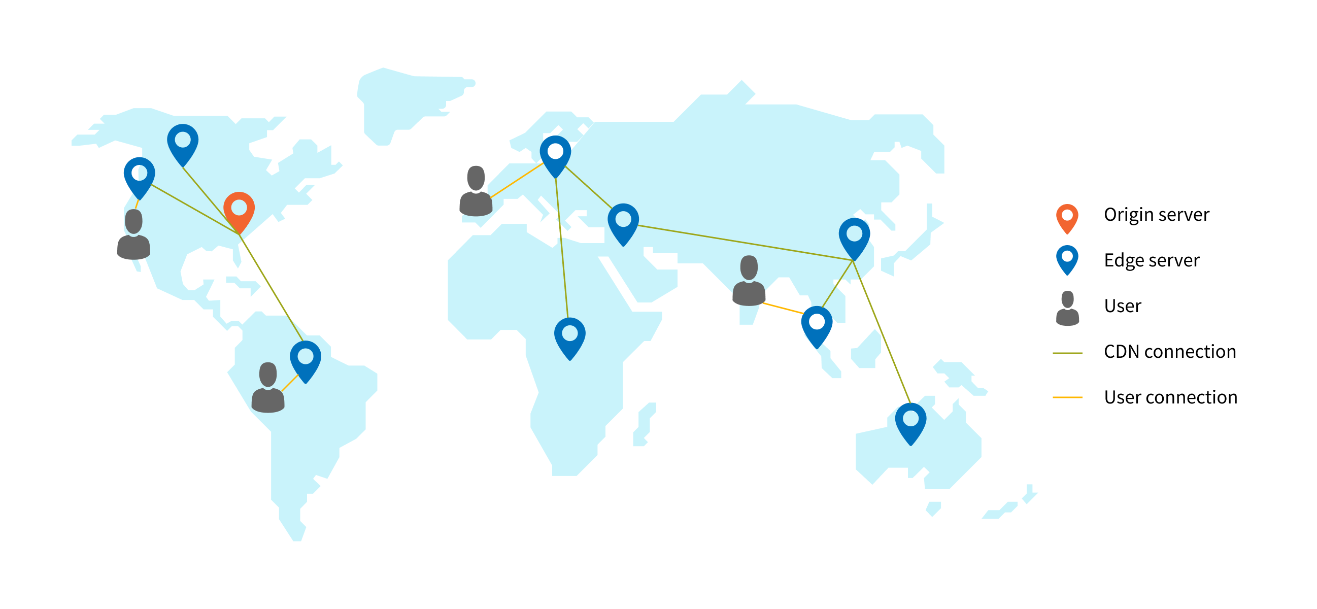
- CDN Support - Content Delivery Network (CDN) represents a geographically distributed platform of servers that help minimize delays in loading web page content by reducing the physical distance between the server and the user.

When a user submits a request for a web page, CDN reduces the delay needed to view the requested resource by reducing the physical distance that the request has to cover. For example, if a user in India wants to view content that originates in a server based in New York they will experience poor loading times if this request has to travel across the Atlantic. To address this issue, CDNs store a cached version of the website content in multiple geographical locations around the world. These locations contain their own caching servers and are responsible for delivering content to users geographically located closer than to the origin server. For more information about CDNs and how they work, take a look at this resource.
You can add support for your CDN via the “Loader” architecture, which allows applications to use a template that will render your image with a set of data about the image directly into the URL. As the component is rendered, a host is selected for the image using the absolute URL, which in combination with the relative path, gives us the URL we need. For example:
{
path: "/photos/bar.jpg",
quality: 70
}
This, in combination with host data from the config file, will produce a URL like this: “https://myApp.imgix.net/photos/bar.jpg?w=1920%q=70”
- Support for self-hosted images - even though this component was designed with CDNs in mind, it also works with locally hosted images. To achieve this, you will need to add an image compression/resizing step to your build process and write a custom loader to generate URLs that will point to the output paths used by the build process.
- Out of the box image support for new developers - for new developers, setting up a custom image pipeline and loader can be a daunting task. So the Next.js team offers a solution that covers those steps directly from the Next.js server.
- Support for one off sources - sometimes you might need to use an external image without a loader. For these cases you can use the noOptimization attribute that tells the image component to use the URL exactly as it was provided and disables all loader-based features.
- Sizes srcset property - since sizes attributes cannot be automatically determined, the image component allows us to pass it as a prop. In this case developers should use documentation to educate themselves on the importance of including sizes attribute information.
- Image priority warnings - since preloads provide a major performance benefit, the image component provides build-time warnings when it discovers that there are image components used on a page, but none of them have a priority set.
You can read more about the initial RFC here. It satisfies all the conditions discussed above and represents an out-of-the-box solution.
How it works
Under the hood, the image component is an extension of the HTML <img> element that evolved over time for the modern web. It does the following:
- Optimizes the image automatically to avoid usage of large images on smaller viewports.
- Serves images in next generation formats (like WebP) if the browser supports them.
- Works with any image source even if it’s hosted by an external data source (Cloudinary, Imgix, etc.)
- Optimizes images on demand as users request them so that the build time won’t increase.
- Provides lazy load functionality so that the images load as they are scrolled into the viewport.
- Allows for the specification of different image sizes for custom resolutions.
- Renders images in a way to avoid Cumulative Layout Shift, a Core Web Vital that Google is going to use in its search ranking.
- Automatically changes the quality of images to a lower threshold of 75 percent, which can be updated for your needs.
How to use it
First of all, let’s create a Next.js app:
npx create-next-app nextjs-image-component-test
cd nextjs-image-component-test
Now let’s find a suitable image for testing. We have used the Pexels website to download this high quality 9.2 MB image below:
Adding the component with an image is fairly straightforward, you just need to import the image component from Next.js framework and add it to your markup. In your index.js file, add the following:
import Image from 'next/image';
export default function Home() {
return (
Width and height are necessary props. If you really don’t want to add them, you can use layout="fill" prop, but we would advise against this because it helps with the Cumulative Layout Shift as mentioned previously. You can read more about layout types here. We will also leave quality to the default value of 75 percent.
The main drawback of the srcset attribute is that it requires quite a bit of additional markup and infrastructure support. You need to create multiple versions of the image files and manually insert them. As you can see, usage is quite simple, and we think it’s a big improvement when you compare it with a standard approach where you need to add srcset and sizes data manually (or with some abstraction you created):
import Image from 'next/image';
<img src="one.jpg"
srcset="two.jpg 100w, three.jpg 500w, four.jpg 1000w"
sizes="<media condition> <width>,
<media condition> <width>,
<optional default image width>">
And even this can be more complex, depending on the breakpoints you want to support. But with an image component this is done automatically, and you can override the default breakpoints that will be used in the next.config.js configuration file.
This is what we get in the browser:
<img alt="universe" src="/_next/image?url=%2Fassets%2Fpexels-kendall-hoopes-6000x4000.jpg&w=3840&q=75" decoding="async" style="visibility: visible; position: absolute; inset: 0px; box-sizing: border-box; padding: 0px; border: none; margin: auto; display: block; width: 0px; height: 0px; min-width: 100%; max-width: 100%; min-height: 100%; max-height: 100%;" sizes="100vw" srcset="/_next/image?url=%2Fassets%2Fpexels-kendall-hoopes-6000x4000.jpg&w=640&q=75 640w, /_next/image?url=%2Fassets%2Fpexels-kendall-hoopes-6000x4000.jpg&w=750&q=75 750w, /_next/image?url=%2Fassets%2Fpexels-kendall-hoopes-6000x4000.jpg&w=828&q=75 828w, /_next/image?url=%2Fassets%2Fpexels-kendall-hoopes-6000x4000.jpg&w=1080&q=75 1080w, /_next/image?url=%2Fassets%2Fpexels-kendall-hoopes-6000x4000.jpg&w=1200&q=75 1200w, /_next/image?url=%2Fassets%2Fpexels-kendall-hoopes-6000x4000.jpg&w=1920&q=75 1920w, /_next/image?url=%2Fassets%2Fpexels-kendall-hoopes-6000x4000.jpg&w=2048&q=75 2048w, /_next/image?url=%2Fassets%2Fpexels-kendall-hoopes-6000x4000.jpg&w=3840&q=75 3840w">
All the best practices are covered, and now browsers can correctly choose the best image for your device.
Comparing results
Let’s show off some results for different sizes. It is important to note here that we are using a Macbook with a Retina display (double density of pixels), so the browser (we will use Chrome) will choose higher quality images, but we will also show results for users that do not have Retina displays.
Desktop with 1920x1080 viewport:
As you can see, the image is using webp format, and it’s size is 4.4 MB, so the compression rate for this viewport is around 50 percent. If you are not using a Retina display, the image used would have been 972 KB in size, which equates to 92 percent compression.
Tablet with 768x1024 viewport:
For tablet users, the size is now 972 KB (92 percent compression). For non-Retina users the size would be 166 KB, which equates to 98 percent compression.
Mobile with 414x736 viewport (iPhone 6/7/8 Plus):
The size is now 354 KB, which equates to 96 percent compression. For non-Retina users the size would be 98 KB, which equates to 99 percent compression.
Conclusion: Improving the experience with Next.js image component
Next.js image component provides a large improvement when compared to other existing solutions. And it’s definitely a step in the right direction, even if there are some caveats that need to be addressed.
We could easily see this being implemented on e-commerce websites that typically include many images to display large product ranges. This handles all the usual issues like preloading, lazy loading of images that are not in the viewport, optimization, etc., all while using best practices.
For example, if you have an e-commerce website, it is of utmost importance to deliver a fast and pleasant experience to your visitors. Since visitors have a short attention span, having a website that loads content slowly, especially product images, makes for a sluggish and frustrating user experience. This is simply not acceptable for people in charge of e-commerce websites. Their sales conversion relies heavily on providing customers a fast and convenient web experience as well as a high rate of availability. If the e-commerce website misses on either point, it will result in significant losses.
Next.js image component in combination with a proper CDN provider has the potential to influence these results in a very positive way, improving the customer experience and boosting your revenues.
Links
- https://www.cloudflare.com/en-gb/learning/cdn/what-is-a-cdn/
- https://developer.mozilla.org/en-US/
- https://github.com/vercel/Next.js/
- https://developers.google.com/
- https://www.belugacdn.com/best-cdn-for-ecommerce/
- https://www.akamai.com/us/en/cdn/what-is-a-cdn.jsp
- https://www.gigaspaces.com/blog/amazon-found-every-100ms-of-latency-cost-them-1-in-sales/#:~:text=A%202017%20Akamai%20study%20shows,latency%20in%20seconds%20and%20milliseconds.
- https://www.akamai.com/uk/en/about/news/press/2017-press/akamai-releases-spring-2017-state-of-online-retail-performance-report.jsp
- https://blog.radware.com/applicationdelivery/applicationaccelerationoptimization/2014[…]e-longer-to-become-interactive-and-why-you-still-need-a-cdn/
- https://blogs.oracle.com/internetintelligence/tracking-cdn-usage-through-historical-dns-data
- https://httparchive.org/
- https://nextjs.org/
- https://web.dev/vitals/
- https://glinden.blogspot.com/2006/11/marissa-mayer-at-web-20.html
