Visualizing insights with an analytics dashboard
In the previous post we discussed which models we tried for sentiment classification and which one has demonstrated the best performance. In this post, we’ll show you how to visualize our under-the-hood findings so that others can see the results of our analysis. You can see our twitter sentiment analysis insights with our demo application here.
The data we have
Let’s briefly recall what we know about the tweets after the sentiment classification is performed. We know the keyword (movie name), the tweet text, the date and exact time, the sentiment (positive or negative), and the number of followers the user who posted the tweet has.
We know that the number of followers can be between zero and hundreds of thousands, and that 50% of Twitter users have 300-600 followers. These are regular users like you or me. There are another ~45% who have up to 5000 followers. These users are likely not professional tweeters, but their influence is much greater than most peoples since their posts or repost will be seen by many hundreds or even thousands of people. Let’s call them opinion leaders. And apparently about 5% of Twitter users have more than 5000 followers. In many cases these Twitter accounts belong to businesses like magazines, cinemas, and other movie industry companies. They are professionals. Who among them — regular users, opinion makers or professionals — make the greatest buzz around a movie? Let’s make this all visible.
Live and historical sentiments
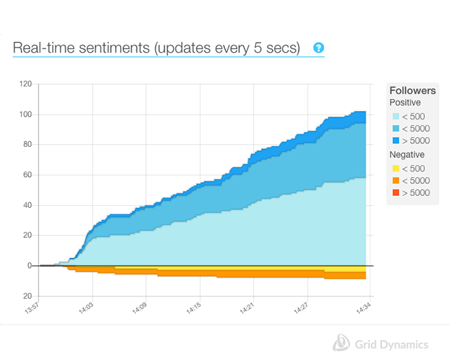
Imagine it’s 5pm on a Friday. What are people tweeting about the Star Wars movie that will be released this weekend? How many tweets in total, how many of them are buzz from, regular users, and how many are part of promo campaigns “warming people up” and “pushing them to spontaneous decisions?” A real-time chart showing a cumulative number of tweets split by sentiment and user category will show us how the situation is developing.

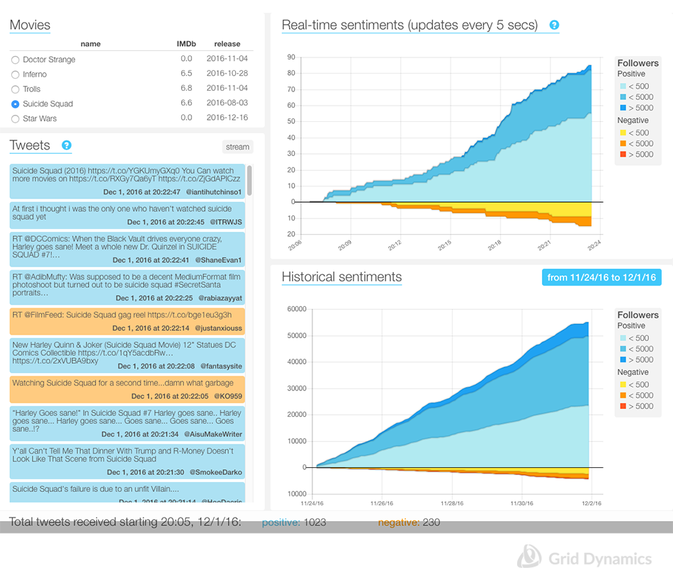
This kind of diagram gives a clear picture, so we want to use it to see long-term trends for the same movie. It might include several days or several months. So we need a chart showing historical data that gives us the ability to choose a range of dates.
Will all that give us a really clear picture? It definitely won’t. Our sentiment classification is far from perfect, so it’s good to see the real tweet stream to understand what people are actually tweeting about. The next useful capability is to see negative or positive tweets representing historical data. Having all that in front of you, you get a comprehensive picture of what is happening now, and what happened hours or days or a month ago, as you can see from the picture below.
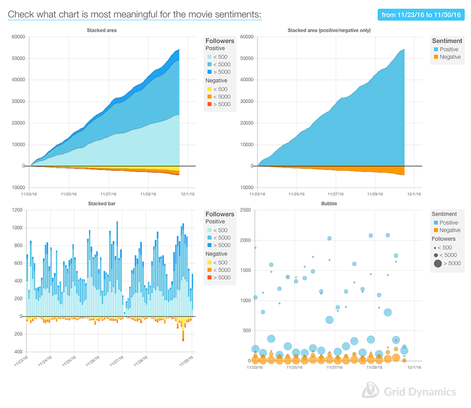
 This informative application can stil be improved. Cumulative diagrams are good to show the total number of tweets received in a given period of time, but they are not very clear in showing cycles and patterns in the number of tweets. Stacked-type diagrams are good for showing the relative contribution of every user type, but they don’t make it easy to perceive absolute values. So the next step could be to check different visualization options to show more “contrasts” in different data aspects for the same movie in the same range of dates.
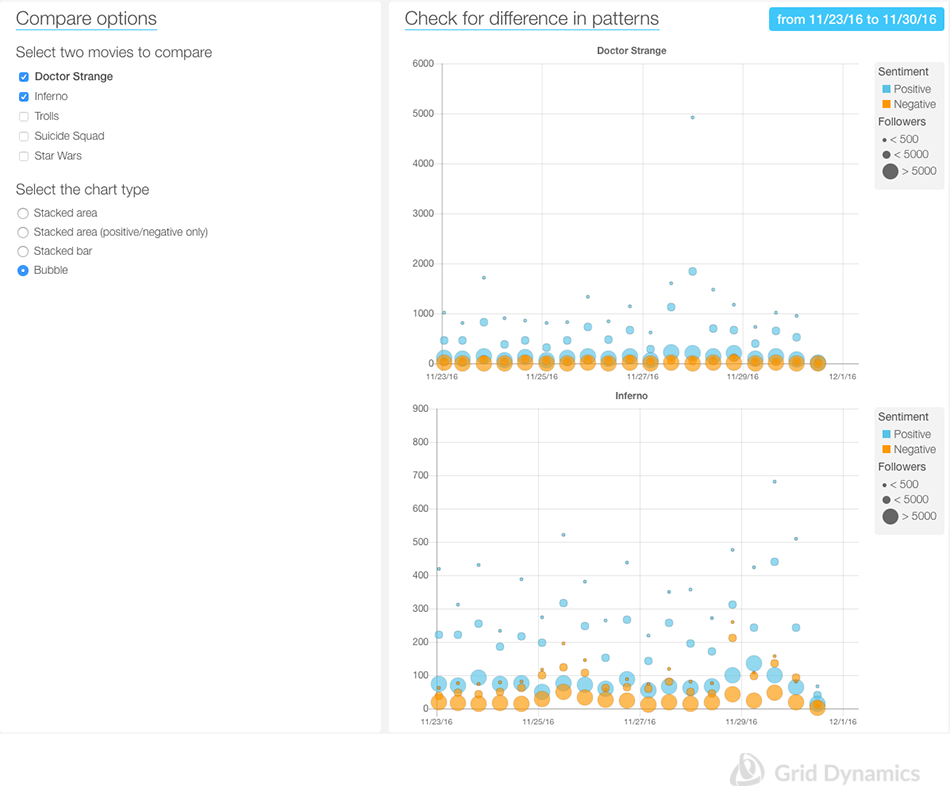
 We can easily recognize cyclic patterns with the “stacked bars” diagram and also see the contribution from regular users, opinion leaders, and professionals with the “bubble diagram.” Now we can say we have a pretty comprehensive picture of the sentiments around one selected movie. Our ultimate goal, of course, is to see if we can visually recognize patterns specific for a particular movie. That can be possible if we see the data for several movies simultaneously. So let’s select two movies and a particular type of diagram to check if there is a significant difference in contribution of various classes of Twitter users in the actual information atmosphere around those movies.

Now we can clearly see that the structure of the public sentiments around the movies is very different. In the picture above, we can see that the activity level of professional Twitter accounts might be significantly higher for one movie than for the other. The diagram shows that the activity of professional users toward “Suicide Squad,” which was released in August, looks very different from activity for the just-released “Inferno.” That might mean a significant difference in social media promotion strategies for these two movies. And that small finding may become the basis for further, deeper investigation into both products’ successes.
With this blog post we close the series of Data Scientist Kitchen blog posts, but we will keep developing new approaches and techniques for data analysis using open source projects. Please subscribe to our blog to keep up to date on the newest posts.
Victoria Livschitz, Anton Ovchinnikov, Joseph Gorelik


